Puzzle Counter: Pt 1 - Wireframes

Tools
For this first step I wanted to try a few different tools to begin to understand the tools that are out there and have a few data points to compare the output of each. For wireframing, I used two general LLMs (Claude and Chat GPT) and one design-specific tool (UX Pilot). For Claude and ChatGPT I used a method of creating simplified and efficient ASCII wireframes that I learned from a guest post by Nimisha Patil from the Design with AI Substack. For my specific goals, I was especially interested in the performance of the general LLMs since they were obviously not built with design in mind, and should thereby give a pretty good sense of how endangered all of our jobs are. If a general use LLM, without special training in design, could effectively work out layout, page flows, interactive elements, etc. then there is no doubt disruption is around the corner (spoiler alert: they did pretty well 😭).
Chat GPT
Version: 5
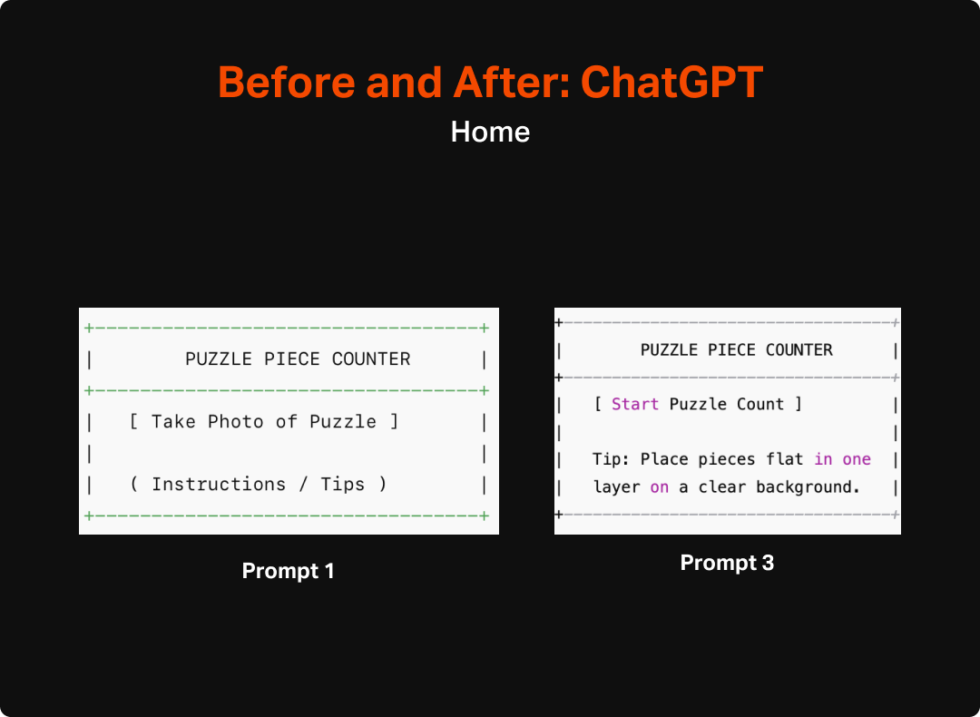
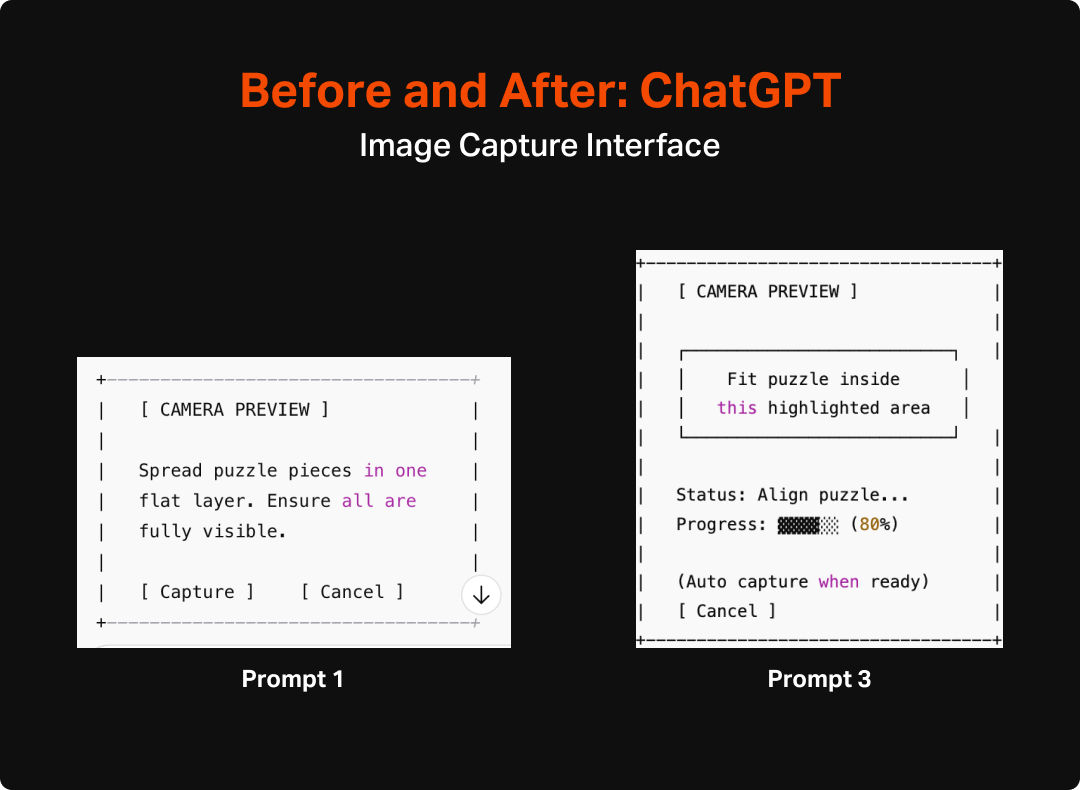
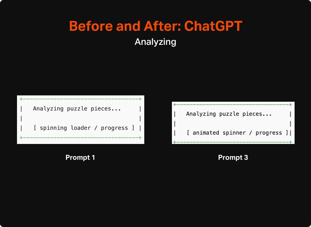
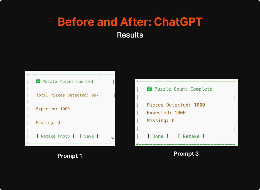
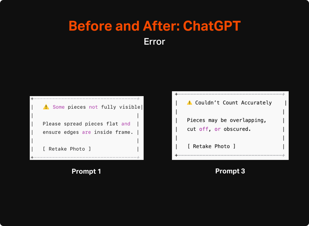
First Impression: Of the 3, it was the least sophisticated in making wireframes. It lacked a lot of detail you would expect, such as navigation and thoughtful layout. However, this is not to say that it didn’t do a reasonable job of identifying the most important elements to have on each page and a general sense of how the pieces fit together.
Claude
Version: Sonnet 4
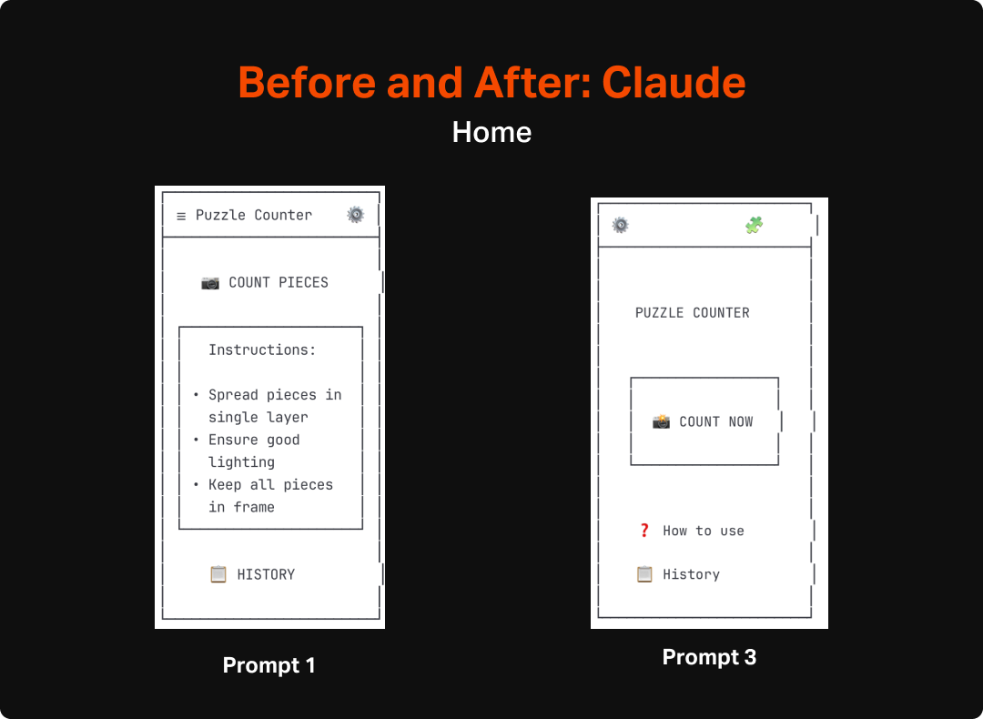
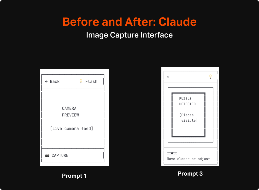
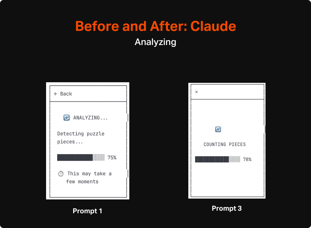
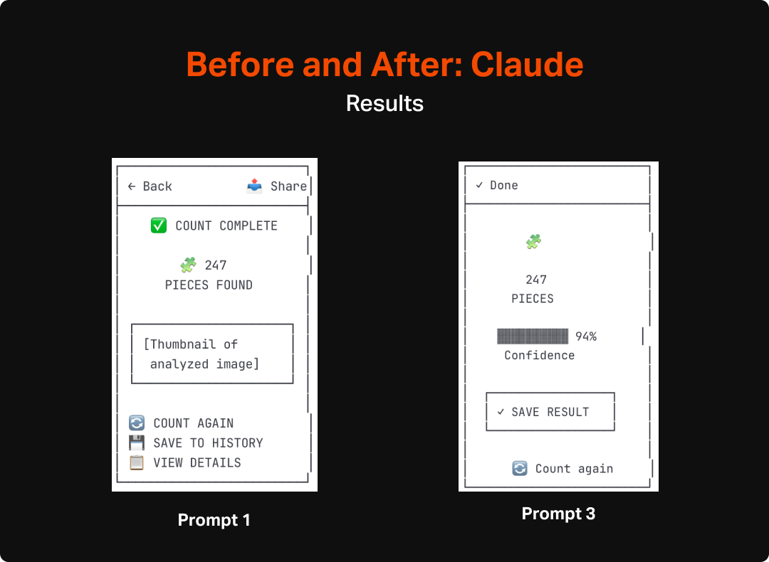
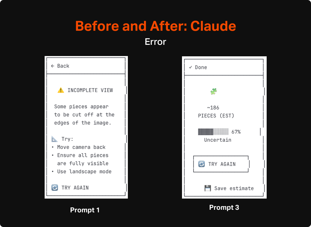
First Impression: Claude’s wireframes were considerably better than Chat GPT. Each screen captured rudimentary (they were ASCII after all) layout and also included navigational elements that communicated indirectly how the entire app would work.
*UX Pilot
Version: Standard Model - May 2025
First Impression: Unsurprisingly UX Pilot’s output was significantly more refined looking than either of the LLMs, however the actual substance of the designs weren’t any better. In fact, of the 3, it was the only one that needed me to designate the type of app (mobile vs desktop) prior to creating designs rather than relying on context clues. This likely is a product of it requiring tokens for creation, but seems like something an AI could have figured out without direct definition.
*I created and iterated less in UX Pilot given the cost. At a future date, will explore bespoke design tools more deeply, but for now wanted to include it as a bit of a supplement to the general AI investigation.
Process
Step 1: Initial Prompts
I used the same initial prompt for each of the 3 tools. I kept things purposefully general to truly test where each model went left to its own devices. I was interested to see how well they each did with:
Identifying user needs and the features to satisfy these
Organizing the features into appropriate layout and hierarchy on the page
Developing an overall structure for a cohesive app
The specific prompt that I used (though removed ASCII language for UX pilot) was:
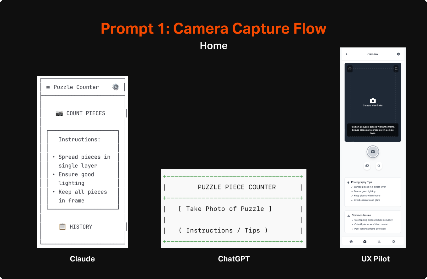
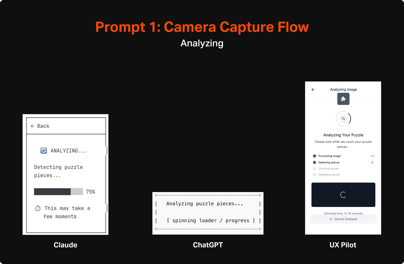
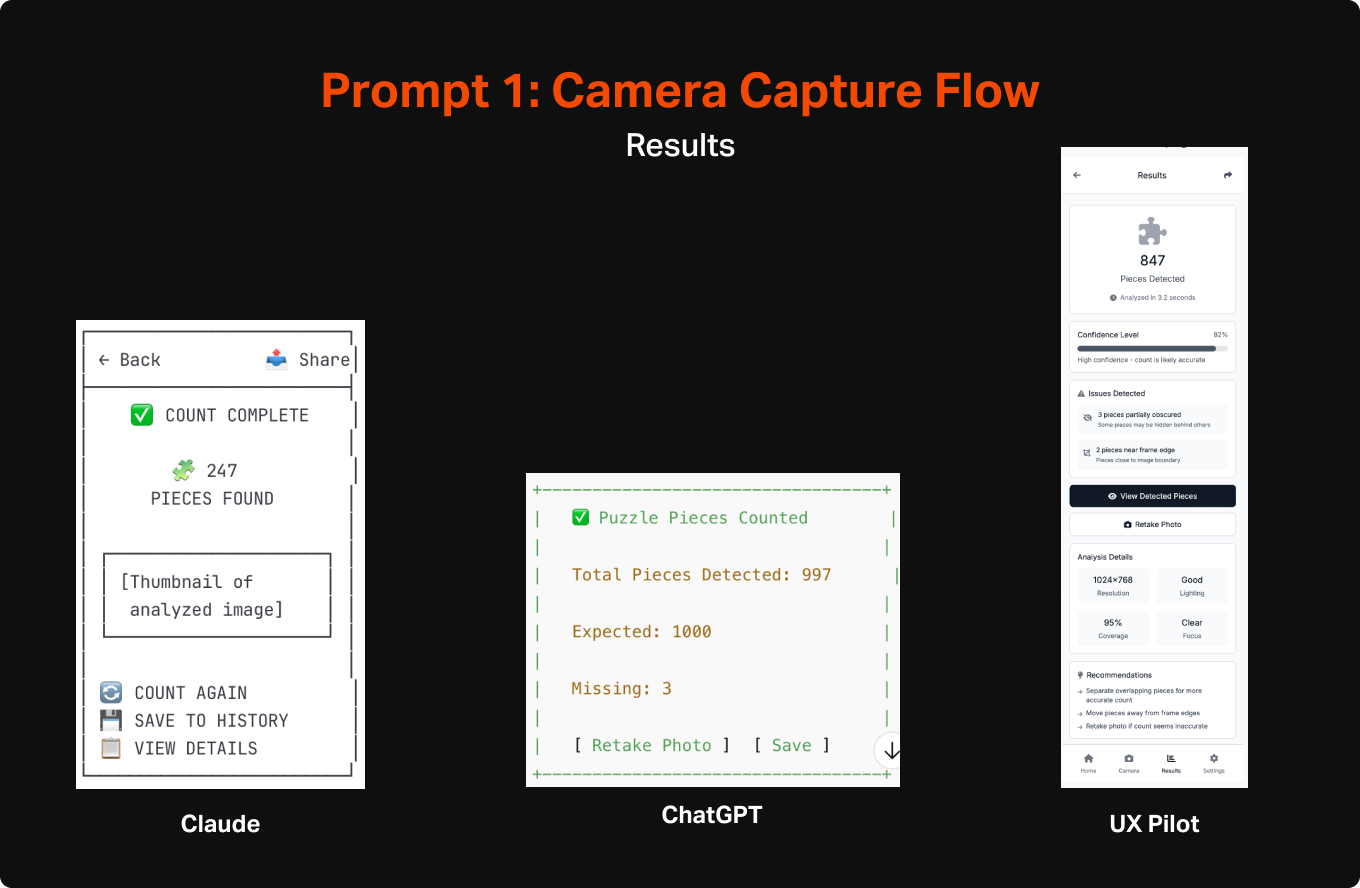
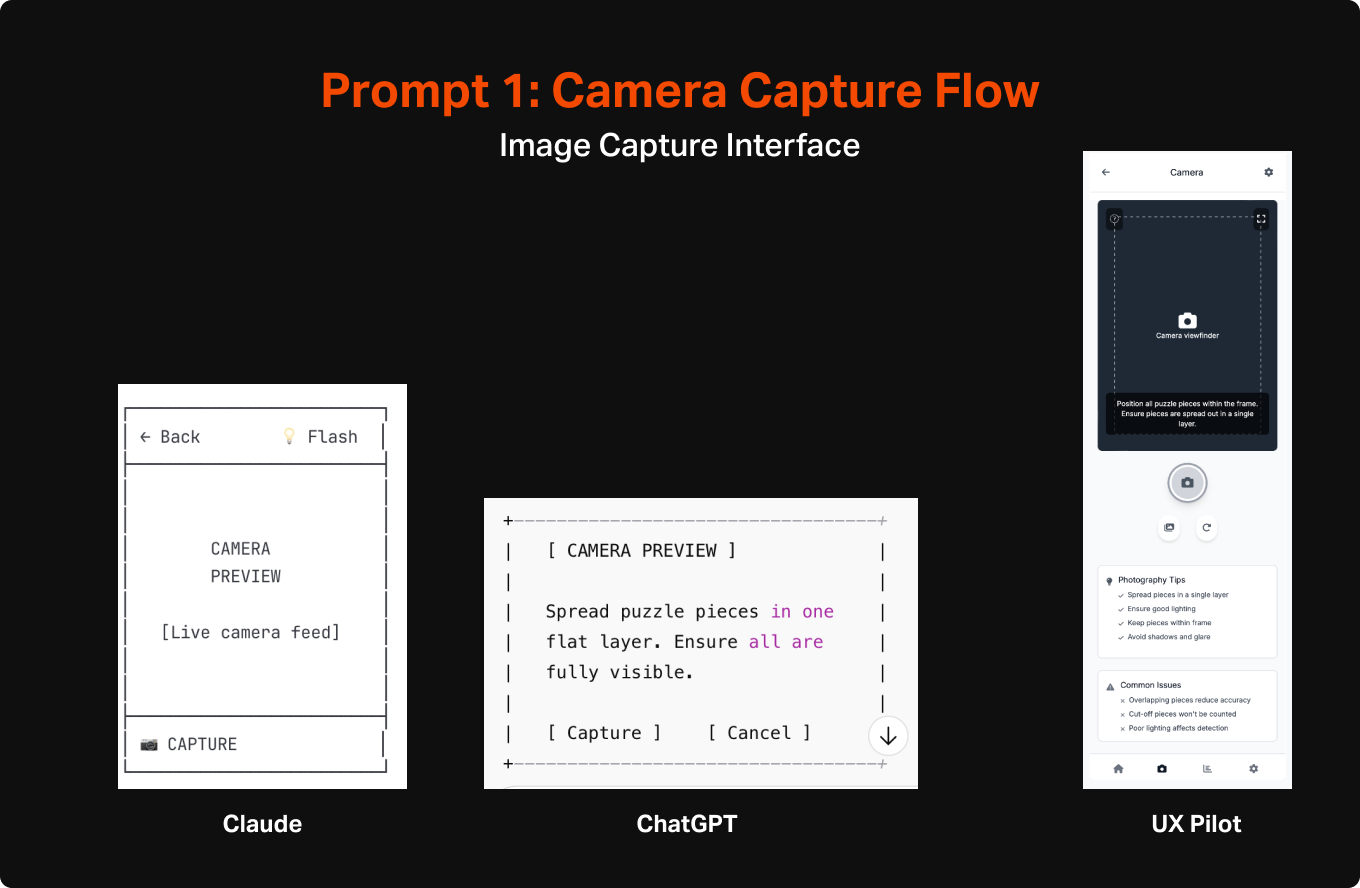
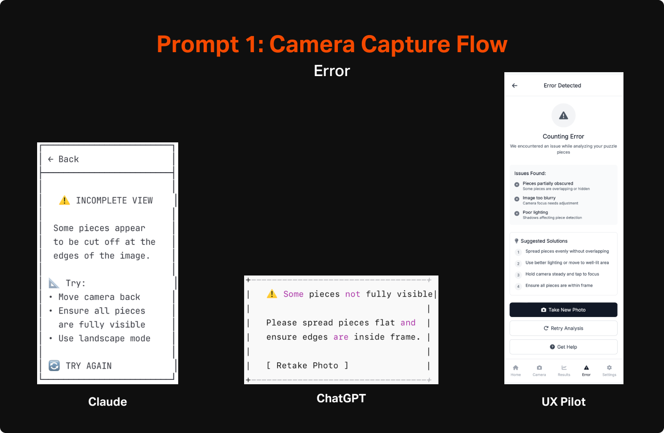
can you create ascii wireframe flows for a mobile app that will take pictures of puzzle pieces to count them to ensure the puzzle is complete. The most important things are for it to be able to view all of the pieces when they are spread out in one layer, assess how many there are, and display the count after counting is complete. It should also be able to give feedback when it is unable to work due to issues like pieces being obscured or cut off. Please also help me identify any other issues that might occur that would need intervention and messaging to ensure the trust of the user is maintained.
The output from these were overall surprisingly good, across all 3 systems. It felt on par with what I would expect from a week or two of work by a design intern, but with AI it was executed within a minute. The level of detail differed across them, but each version seemed to identify the same general set of features, including CTA to initiate the capture mode, some instructional content to explain the purpose and how to use it, loading states, success states, and error states.
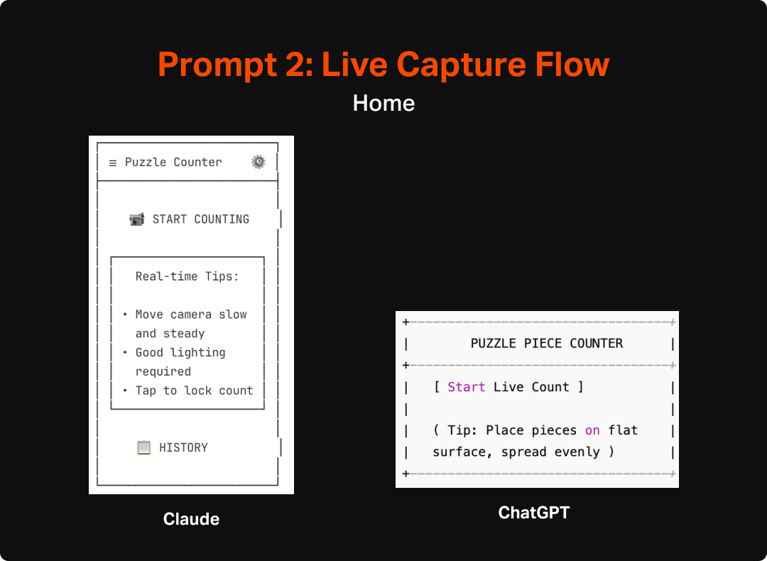
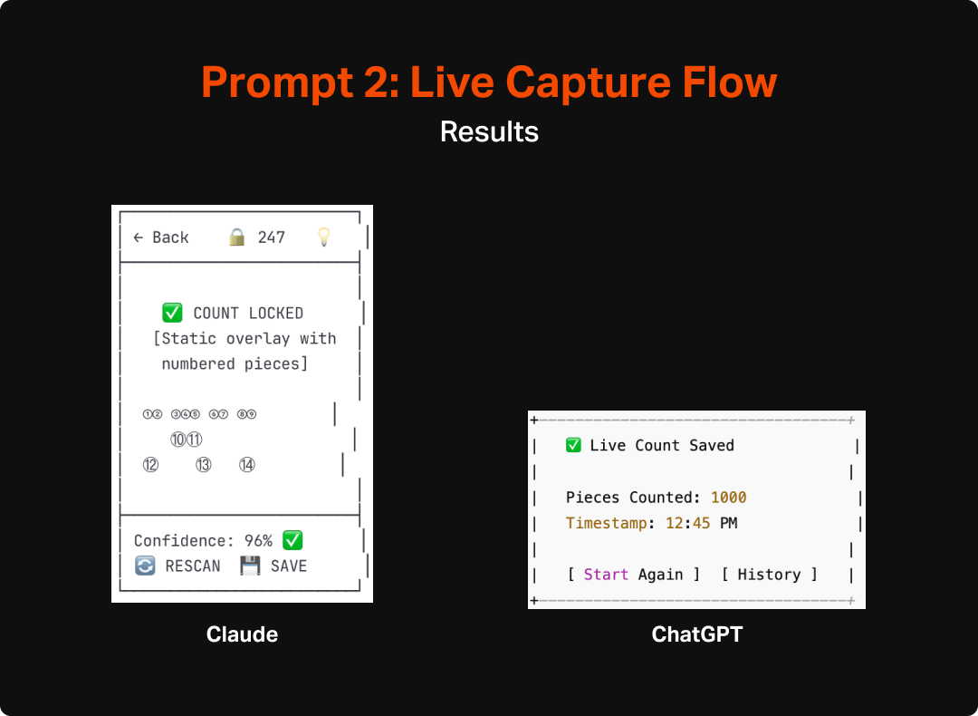
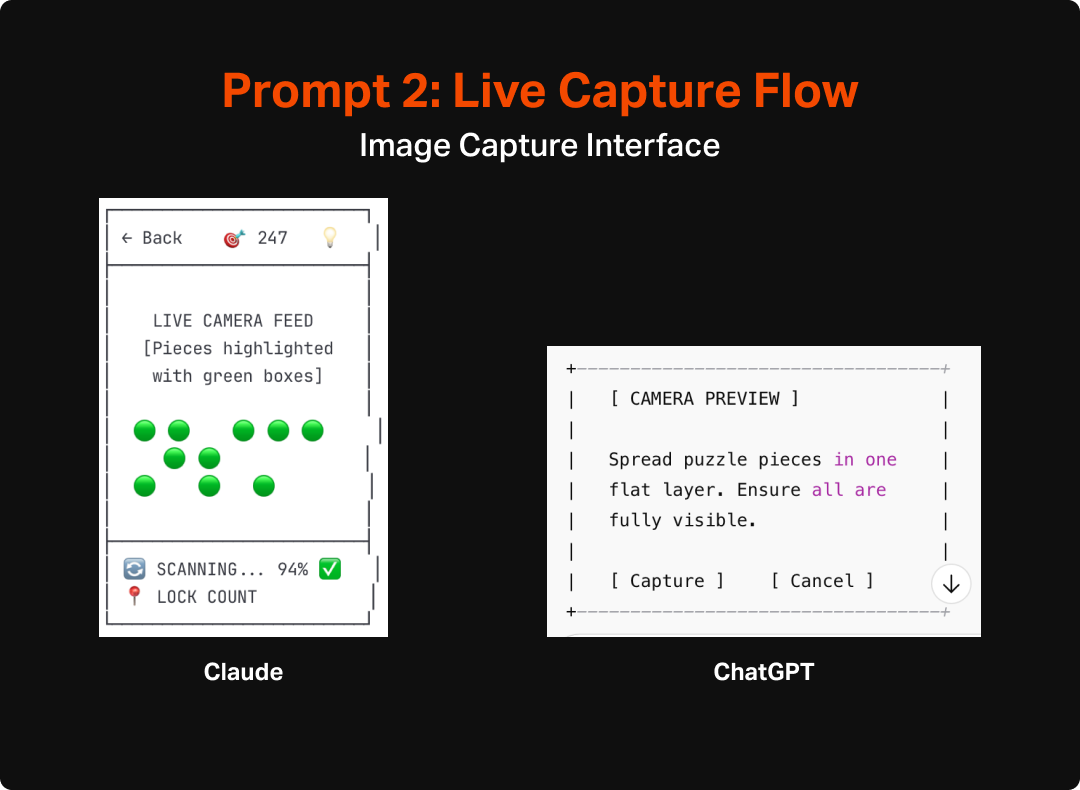
As an additional test, I asked the LLMs to do an additional version that assumed real-time counting. This would give me some additional insight into how the AI would react to a shift in scope, as well as provide some interesting fodder for thinking about how to make the most useful and engaging version of this tool. Both Claude and ChatGPT made pretty similar updates to their flows and UIs to account for the switch to real-time interaction. They both integrated a more explicit overlay that would highlight each area it interpreted as a “piece” as well as a mechanism for locking in the count and they also updated the language to make more sense with the new model (e.g. “lock count” instead of “capture” or “take photo”). Aside from the overlay and language though, the experience and structure of the app wasn’t much updated and unfortunately didn’t spark any additional fidelity from ChatGPT, which remained pretty void of detail or completeness.
After reviewing the two sets of wireframes I decided that something closer to the original model would make more sense. I arrived at that decision after imagining how finicky a real time, constantly-updating version might be, particularly for anyone who might have any sort of tremor or wrist issues that would make it even harder to execute. Additionally it seems likely that a model like that would be much harder to code and take a lot of on-device processing to pull off. The second exploration did, however, inspire me to rethink the capture screen in the first version. It got me thinking about how this process was very similar to check-cashing interfaces in banking apps, which I have found to be easy to use with intuitive feedback. I integrated wording in the next prompts that implied as much which felt like a material improvement from the first version.
Step 2: Review and Mark Up
While the speedily constructed wireframes were a good starting point, it was immediately clear (as any it would be for any first draft) that there were refinements that needed to be made. I pulled the different outputs into a Figma file and made notes about the good, bad, and interesting aspects of the different designs to identify what aspects should be carried forward vs what I would change or cut altogether.


This process felt very much like flexing the same muscles I would in a critique or design review with a junior colleague. This was a little less interactive than I would like from an actual crit or review. In a real scenario when working with a team, I would probably operationalize this by having a more junior designer go through some iterations with the AI tool, and then have the interactive conversation with them about how they got to where they got to and then review the results together. This would provide a chance to collaborate on refinement around known user behaviors/needs and our business goals. This would also allow us to use the AI for what it is best at, namely quick ideation for a starting point, and then use the power of peer-to-peer collaboration to bring it back into the realm of purposeful and human-centered design.
“In a real scenario when working with a team, I would operationalize this by having a more junior designer go through some iterations with the AI tool, and then have the interactive conversation with them about how they got to where they got to and then review the results together.”
In this case, as it was just me and the LLMs, I later (after additional refinement) went back to the tools and asked them to better explain why different elements were there and what customer value they provided. This allowed me to learn a bit more about how they “thought” and start to understand the assumptions they were making and how true their understanding of user behavior was. This could also, in the absence of time/budget/headcount, help to clarify my own thoughts and assumptions and introduce some new ideas that could be considered in my design process. The end results tended to be pretty good. At both a page-level and element level, the rationale was pretty good. One caveat for this, and something I will test in future uses, is that I already refined the wireframes earlier with some guidance around simplification and user behavior, which might have affected the output. However, the articulation of purpose was still impressive. Here are a few examples of their replies:


The rationale provided by these LLMs largely aligned with my own assumptions and understanding of user needs. The only cases that seemed a bit off to me are some of the assumptions around individual features, particularly things like the history or supplementary explanation (tips, instructions, confidence levels, etc.). Some of these seemed to assume a much deeper engagement with the tool than I would expect (I definitely do not envision this being any sort of nostalgic look back at the puzzles users have done, especially since the photo would be of the unfinished state), but not outside of the realms of assumptions and ideas I would expect to come up in any early stage ideation.
Step 3: Re-Prompt and Refine
After reviewing the original output and identifying areas I wanted each LLM to refine, I moved on to testing how well they could be prompted into improving the wireframes. I crafted two slightly different versions of an “make these better” prompt, each tailored to the areas where I found the original set lacking. In the case of Claude, the focus was a bit more on simplifying since the original version was bloated with features and UI that was more distracting than helpful. In the case of Chat GPT I was hoping to get a more cohesive design rather than a series of discrete pages on top of also simplifying things.


The results of the refinement prompt were of mixed quality, and not really of higher-fidelity in any meaningful sense. ChatGPT’s updates were especially disappointing as it made very few changes to the original set beyond some slight wording shifts and the necessary updates to accommodate the Auto-Capture functionality I requested. Most troublingly, it failed to add any additional navigation, despite my explicit request for that specific change. Claude’s output on the other hand seemed to hit all of the targets I had requested, but didn’t really add a whole lot beyond the basics.
Ultimately, the output of this round still gives me a reasonable starting point to get into more refined design. My next steps will be to try a few more prompts to hopefully get a bit closer to what I have in mind as a quality experience, and then move on to using AI to up-level the fidelity for my next post. For this effort, I will aim to do as little hands-on design as possible, and instead use prompts and features of the different tools to get the experience built.
Conclusion
Overall, I am impressed with the progress that has been made in AI’s ability to discern, communicate, and build screens around user needs. It has been a number of months since I last put any of these tools to the test for this type of design, and it is world’s better than the slop it put out less than a year ago. The LLMs were able to pretty clearly identify and articulate the elements that would be needed for the Puzzle tool and even create a pretty spot-on hierarchy of needs. Most of the issues I saw were traps that I could imagine a relatively junior designer fall into, including bloating the app with too many features and overestimating the primacy of the app in users lives, rather than focusing in on what is most important and making it serve that function as well as possible.
I anticipate that I will be incorporating the use of these tools for early stage design going forward. I see it playing an important role in early ideation and can imagine that, especially after honing prompting skills, that early stage wireframing will be primarily, if not completely accomplished by these tools. The biggest question going forward will likely be which specific tool I would use. As a freelancer or working on independent projects, I will probably continue to use Claude since it seemed considerably better at systematic design than ChatGPT. However, the integration between UX Pilot and other design tools might push the needle towards it (or another bespoke tool) if the next step of this process requires a lot of manual effort to turn the ASCII wireframes into actual designs. While I am relatively speedy in Figma, I must admit that even with largely copying the output of this exercise, it will take me quite a bit longer to create the screens I need manually than it took UX Pilot to do the same.