
Puzzle Counter Pt. 2: Visual Design
This post promises to be a shorter one. I realized pretty quickly into this stage that my assumptions about how this process would work end-to-end were not correct. I imagined that once I had some sets of wireframes from the initial explorations, I would import those into a tool and voila they would import and provide a the tools necessary to create, edit, and apply a cohesive design system. In reality, this didn’t seem to be the way most tools worked, likely for the best, since there are more straightforward workflows available.
The Old Ways Are Not the New WaysAs anticipated, the best path to a good end result for AI does not necessarily mimic what we have always done…but with AI. Wireframing in an llm will continue being helpful for ideation but the actual layout for a design can be done just as well in modern AI coders or Figma with Make.
I explored a handful of options for trying to carry my previous work forward and none of them really did exactly what I was looking for, namely converting wireframes into full visual comps and a design system. Instead they tended go straight to prototypes with full code, and in most cases had limited abilities to use a set of wireframes as a starting point.
So I will use this post to walk through the progress I was able to make by using both Figma and Lovable to prompt my way towards the look, feel, and interaction i was looking for. Ultimately, I was able to use both tools to create fairly refined and semi (will go through this later) elegant designs for the app.
I will start with a brief overview of the two tools and their capabilities:
Lovable
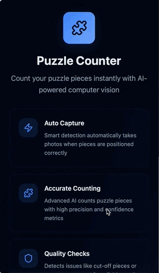
Description: Lovable is an AI-powered app development platform that lets users create full-stack applications from natural language prompts without needing to write code. There are a number of tools that work similarly (Replit, Bolt, etc.) but Lovable kept coming up in my reading so seemed like a good place to start.
Capabilities: natural language prompting (front end, backend, db), instant previews, Figma import, free plan
What it Did Well: The coding was obviously the bread and butter for Lovable. It was really impressive to me that I was able to use my phone camera for the capture automatically.
What It Struggled With: Design polish was the biggest issue. It didn’t do a great job following my prompts to get the color scheme I was looking for. In real life this might not be too big of an issue as I would create the design system separately rather than trying to define that as I created the functionality, but it was noticeably worse than Figma.
Figma AI
Description: Figma has begun to integrate some pretty cool features for quickly spinning up designs (First Draft, Make an Image, Figma Make) and using static designs or prompts to create working prototypes (Figma Make). Figma Make turned out to be the only tool that I could find that would directly turn my ASCII wireframes into a prototype, so I was able to test that flow and could image it could be useful if I landed on something great in early Claude ideation.
Capabilities: natural language prompting for designs and rudimentary code, instant previews, Figma import and export (you can turn , free plan
What it Did Well: Figma Make’s output was quite a bit more polished than what I found with Lovable, and it was able to turn most of my prompts into approximately what I was looking for in visual design, motion, etc.
What It Struggled With: Creating and modifying my Puzzle Piece icon, updating the capture area to the correct side (common issue across both).
Lovable
I had hoped that Lovable would allow me to upload some rudimentary wireframes that I had already refined and it would then spit out a nice prototype based on that. This would have aligned nicely with what I had done so far and built off of what I had already done. However, there didn’t really seem to be a way to do that, so I decided to just start from scratch in the tool.

Initial PromptI used the same starting prompt I had done for the original wireframes to see what the differences were, beyond the obvious of higher fidelity and working code at the end.
The outcome I got was….okay. The technical side was pretty impressive. It created a working prototype that even connected to my phone camera, that presumably (not a dev and didn’t dig too deep here) had the building blocks for a working, shippable app. However, the UX was kinda rough. The user is dropped into a very rudimentary looking capture screen with odd layout, a flashing message at the top, the auto-capture hides the image that will be taken, an odd “reset option” and there are a lot of redundant messages that make it feel really busy. It really didn’t fee like an app as much as a homespun utility, which for 5 minutes of work is still very impressive, but not what I was expecting based on hype and previous experience with tools like it.

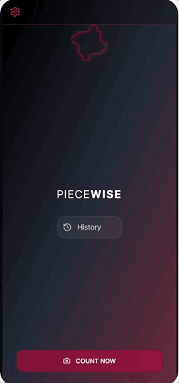
Sometimes a V0 Really Feels Like a V0The first version had a lot of the basic features I was looking for, but needed some work.
I then continued to refine the functionality, look and feel, layout, and add pages and features to the app over the next couple of days as my free daily tokens re-upped. Overall it was easy to guide the machine and I had very few instances of having to revert, instead it felt like I was making consistent, incremental improvements similar to quick-version design.
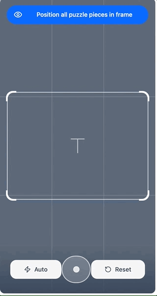
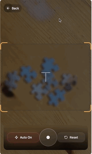
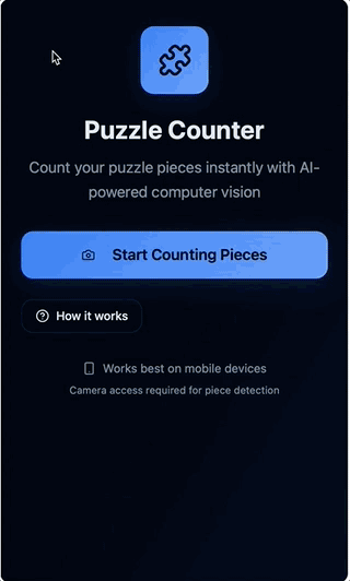
I worked on expanding the functionality to feel like a real app, editing down some of the content, adjusting features (remove redundant toast, remove “reset button” and layout, and visual design updates for both polish (glassy styling) and functionality (make the capture area clear instead of blurred. I tended to work by making one or two large prompts to get make big leaps, and then follow up prompts as I reviewed what had been done and saw things that didn’t work. All-in-all, this was a pretty fast and effective method, though ran into some issues that took longer than others like the size of the capture area and the visual styling of the app
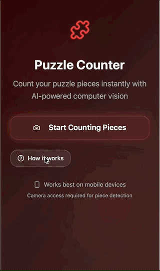
The visual styling itself was one of the most problematic, though also one of the easiest to solve since a paid subscription allows for direct editing of the code which would give me much more precision and speed for getting things looking exactly as I want.
After several hours (over a course of a few days due to daily token limits) I was able to refine the app pretty well. The basic functionality of initiating the capture, taking a photo, and getting results and confidence was all there. Additionally, the visual design was pretty good, though I kinda threw up my hands after several prompts trying to brighten things up a bit and reduce the sludginess. Again, this is something that I would handle differently anyway, as I don’t think ad hoc prompts is the right way to define app visuals and design system, but something to note as far as limitations.
Figma
The other tool that I used was Figma, which had two features that seemed promising. The first was First Draft, which allows you to create and edit designs through prompts. This seemed like it could provide a pretty good path to a more polished version of the puzzle app, though without necessarily building off of what I had already done. I will go into very short detail on this, as I ultimately gave up quickly since it seemed pretty underbaked.
I approached the prompts for First Draft similarly to how I had done in other tools, and expected that the outcome would be a relatively high-polish experience that I could build off of. However, the result felt really wire-framey and even when I tried to prompt it into attractiveness it failed. Additionally, it was limited to a single screen at a time, which also made it a poor option for building out a full featured, coordinated app.

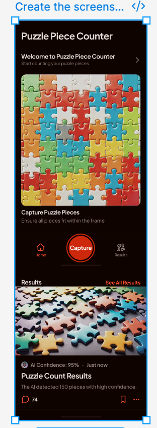
I quickly moved on to Figma Make as a potential option for building up the fidelity of my app design. I was glad I did. Figma Make quickly created an interactive prototype based on my existing Claude wireframes and a short prompt to put the images into context.
The initial version was pretty simple, but retained much of the layout and intention of the original one, creating a pretty basic end-to-end prototype that could then be refined via prompts to improve the styling, layout, and functionality.
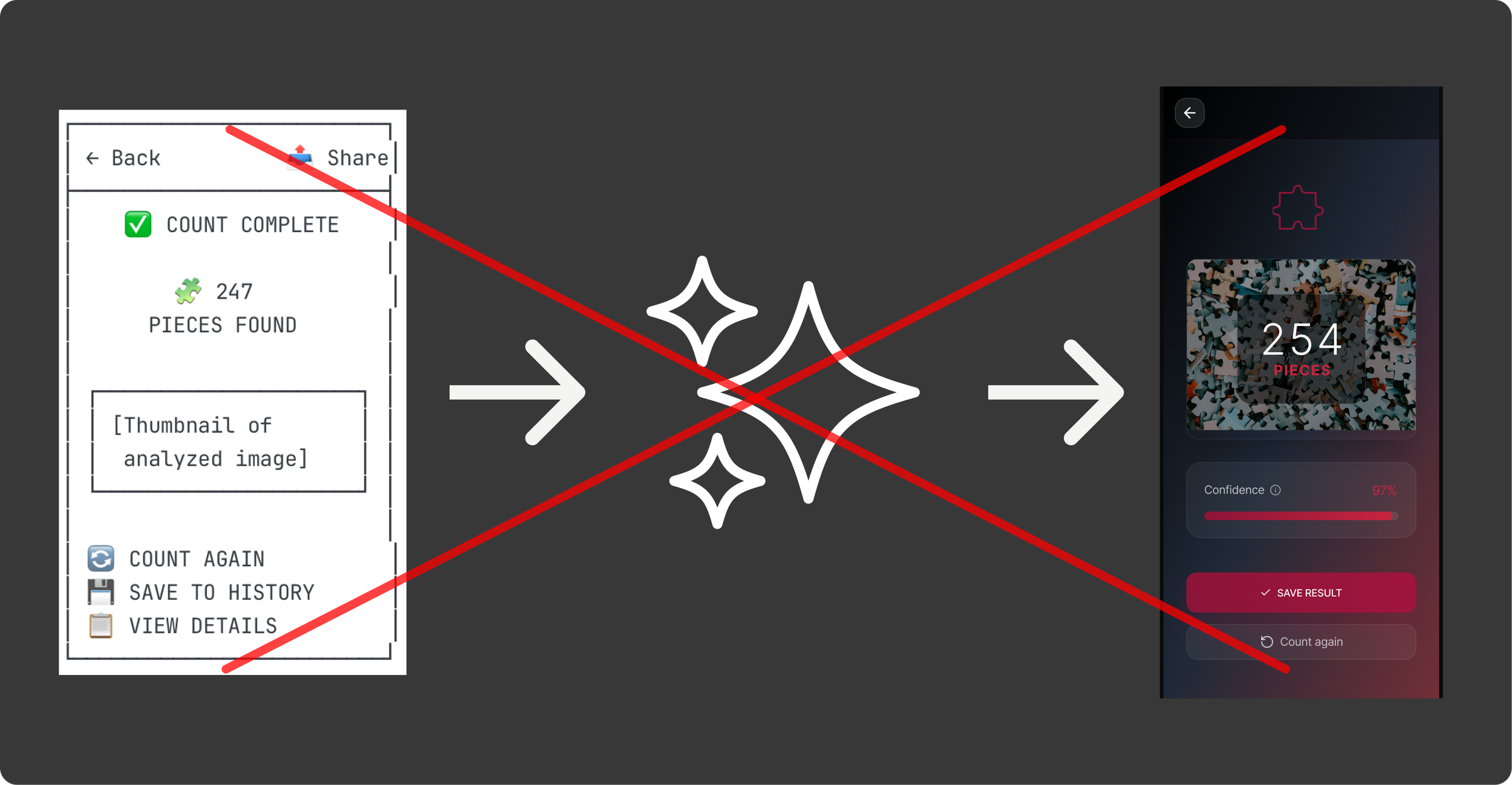
I Rate it V0.5Figma Make’s v0 was quite a bit better than what I got from Lovable. The ability to upload images as a starting point really helped solidify my intent from the get-go.
With such a solid starting point, I was able to quickly iterate on the specifics of the experience and design system. In the course of a few hours I modified the experience to a very fine degree. Figma Make was really good at making minor adjustments to the visual styling (glass design, specific red hues, etc.), animations (back sliding animation, image capture transitions, etc.), layout (lots of iterating on the capture screen to feel right), and even spinning up new pages (saved counts).
I found prompting the tool to do what I want to be really easy. It felt very similar to times when I would work with a dev or design technologist to get things just right. I would prompt something like:
“Add a smoother transition for the loading screen. Thinking a .3s ease-in with a subsequent ease out when it ends.”
I could then review what had been done and make adjustments as I needed to. In the future, one thing I would do differently is to give a bit more explicit instructions, particularly when I expected changes to affect multiple contexts. There were a few times when components that I felt were basically the same (e.g. results screen and history screen) that didn’t get updated when I prompted a change to one and not the other.
In the end, I was able to create a design that felt cohesive, polished, and tuned to the goals of the user. There are certain things I would refine prior to going to delivery (fine tune the capture flow, update icons and loaders, etc.), but ultimately the output from Figma Make allowed me to get really close really quickly.
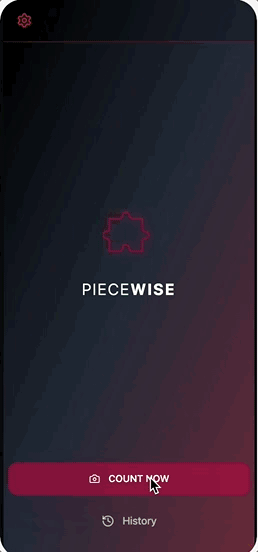
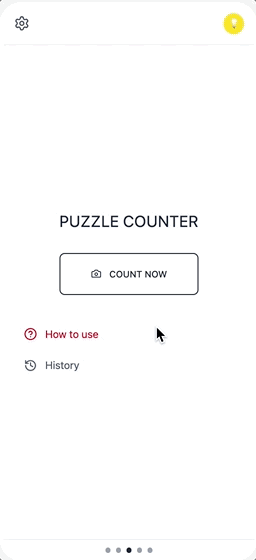
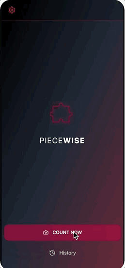
Final VersionFigma Make was impressive in it’s ability to create and refine highly-polished designs.
I will leave it off with that. I will continue working on the app, but might leave it here with some last thoughts next week, since building the entire experience will require a decent amount of model training to have anything I would consider releasing into the wild. So coming up next will be my thoughts on the process I went through, and what I would do differently in future projects, including how it might be different depending on context (e.g. freelance project, design at big org with dev resources, etc.