I Saw the Signs
As I discussed in the first post of this blog, I recently uprooted from Seattle to Edinburgh. There is a lot about the two places that are pretty similar: the mix of hills and sea, the dark and wet winters, the toned-down pallettes of the locals’ wardrobes. There is also, obviously, quite a bit that distinguishes my new home (900 year old city in Scotland) from my old one (~120 year old city in the Pacific Northwest). One of the subtler characteristics that has caught my eye is how prevalent hand-painted signs are on Edinburgh’s shopfronts. To be sure, there are plenty of gaudy and loud plastic and backlit signs along the high-streets, but that scream is almost equaled out by the confident and quiet assertions of the many understated and unique hand painted signs.
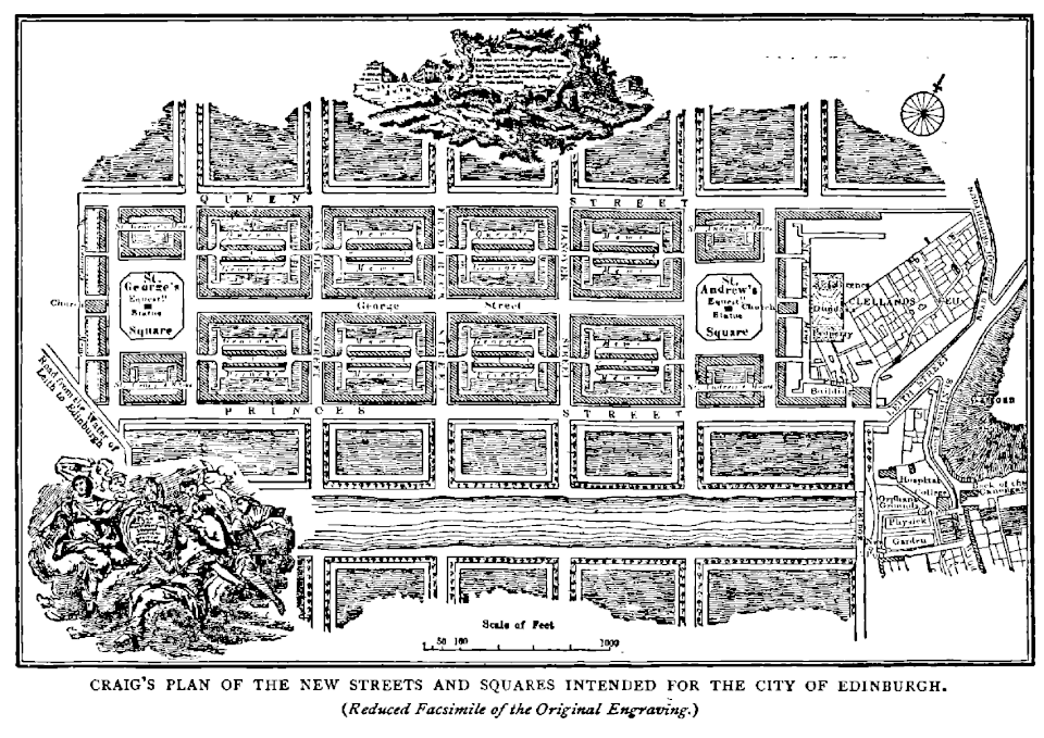
James Craig’s New Town Plan Source: Old and New Edinburgh, Vol. III, Ch. 16 http://www.oldandnewedinburgh.co.uk/volume3/page129.html |Author =James Craig |Date =18th century
What I love about these signs is their timelessness and graceful simplicity and how perfectly that aligns with the character of Edinburgh. As mentioned earlier, Edinburgh is OLD. And as an old city, it has many of the characteristics you would expect: decidedly non-grid layout, layers upon layers of monuments/placards/memorials, cobbled streets, and a charming patina of wear and decay that reminds you that she exists in a different scale of time than we do. But there is also another side of Edinburgh that is strikingly not that. This Edinburgh is intricately planned and gracefully executed as embodied in massive undertaking such as Edinburgh’s New Town or the thoughtfully constructed Water of Leith walkways that connect distant corners of the city with verdant and clean paths. The intermixing of this feel of being grounded in something ancient and traditional while also having elements of more contemporary design-thinking is perfectly encapsulated in the use of simple paint to communicate and entice modern shoppers and diners into a store or restaurant.
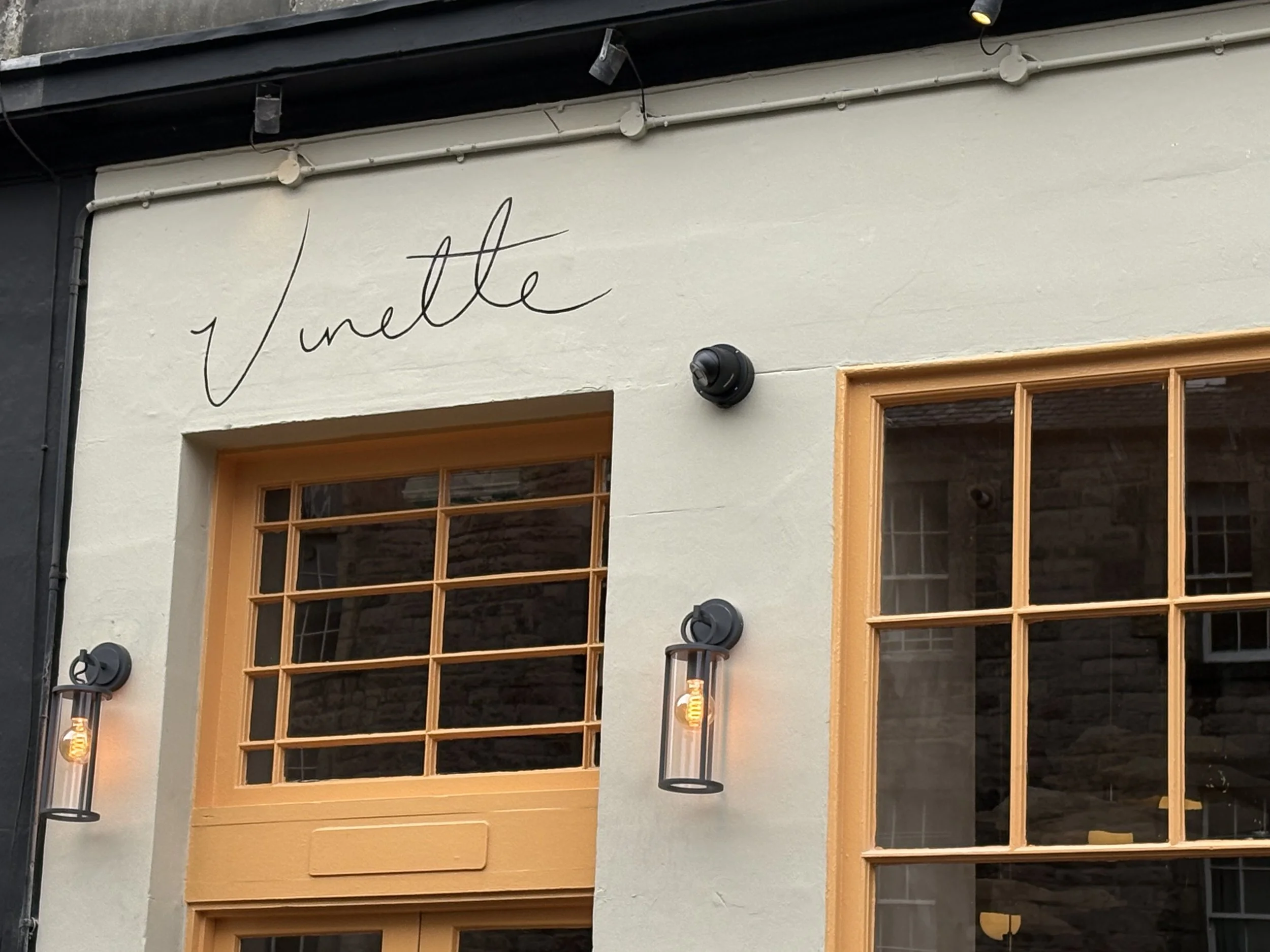
Vinette uses minimal paint to express maximal personality.
The signs themselves are, with few exceptions, composed solely of color+text, with the occasional flourish of iconography. With these limited elements, businesses have found ways to perfectly capture the personality of their establishment and hint at the experience you can expect within. Take, for example, the front of the high-end french restaurant Vinette. Their design is built around an audaciously confident understatement. They have an entire field to work with and they make their mark with the lightest lined scribble of their name, leaving the rest of the empty space be. Seeing this, one can easily imagine a menu of sumptuous dishes that reach gustatory heights, not with pomp or frivolity, but with a cultivated palette of simple, top-quality ingredients put together with creativity and gusto.
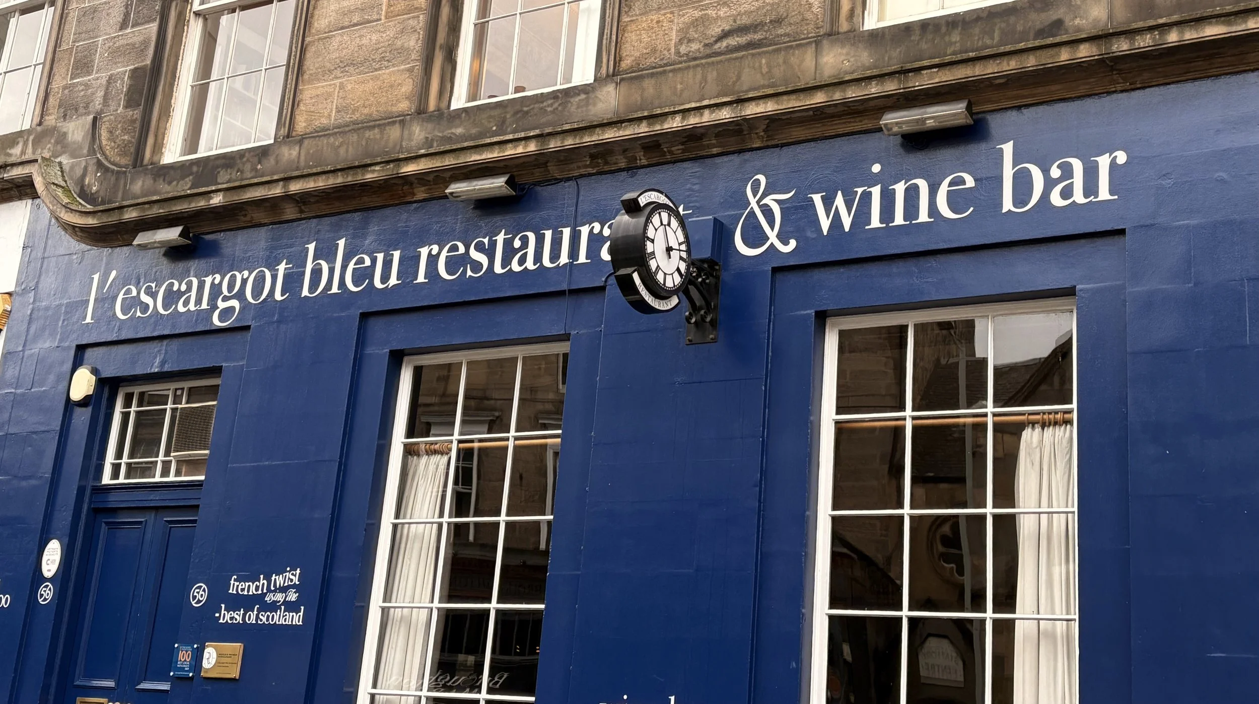
Contrast this modern, almost cheeky minimalism with another French Restaurant, l’escargot bleu, who are using the same basic elements of color and typography, but immediately tell a different story. The conservative and stately look of the painted sign signal that when you step into the doors, you will be transported to an environment of classic Francophile delights. It’s hewing to traditional aesthetics also prepares you for a meal that similarly works within the confines of classic French cuisine, focusing on craft and perfect execution, as compared to Vinette’s look which implies a bit more playfulness and willingness to experiment and push some boundaries.
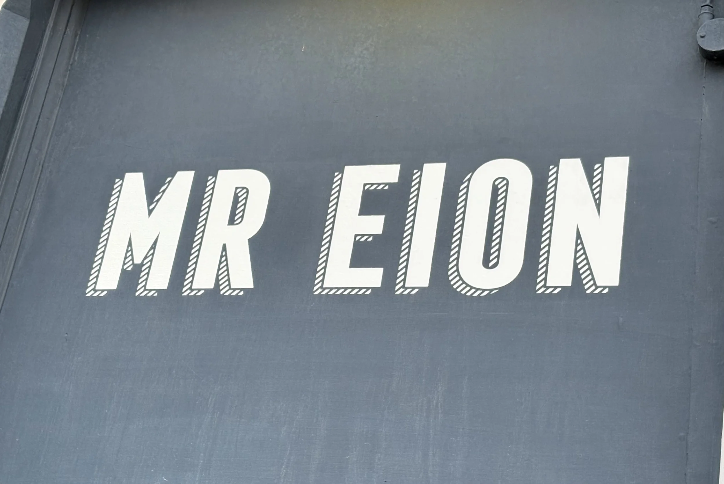
While the signage of these restaurants have many contrasting visual characteristics, they both also have a look that says “pounds will be spent.” They both go after it in a different way, but the front of these establishments hammer home that this is a place of refinement and should be respected as such. This is in contrast to what I see a lot with the coffee shops around Edinburgh, which are other businesses that tend to use their signs to good, yet different effect. True to the overall sophisticated, yet contemporary vibe of coffee shops, the best of these signs are also design-forward but with a look that is more approachable and fun. MR EION is a good example of this. It is clear that thought went into the design, with it’s chonky, leaning font and striped offset shadow, but the effect is to make a customer feel like they are going to partake in a fun and modern coffee experience (pour overs, single-origin beans, angular modern furniture) as approachable luxury.

Hopetown Coffee does something very similar with it’s signage. It also uses a blocky modern font but instead of stylizing with a shadow, it uses a simple outline box as a subtle flourish. Taken with the colorful and playful window design, it gives off a welcome and warm feel that is inviting and cheery which perfectly compliments their business model as a non-profit that “allow(s) people to purchase their daily coffee and cake knowing that their money is going directly to helping people affected by poor mental health.”
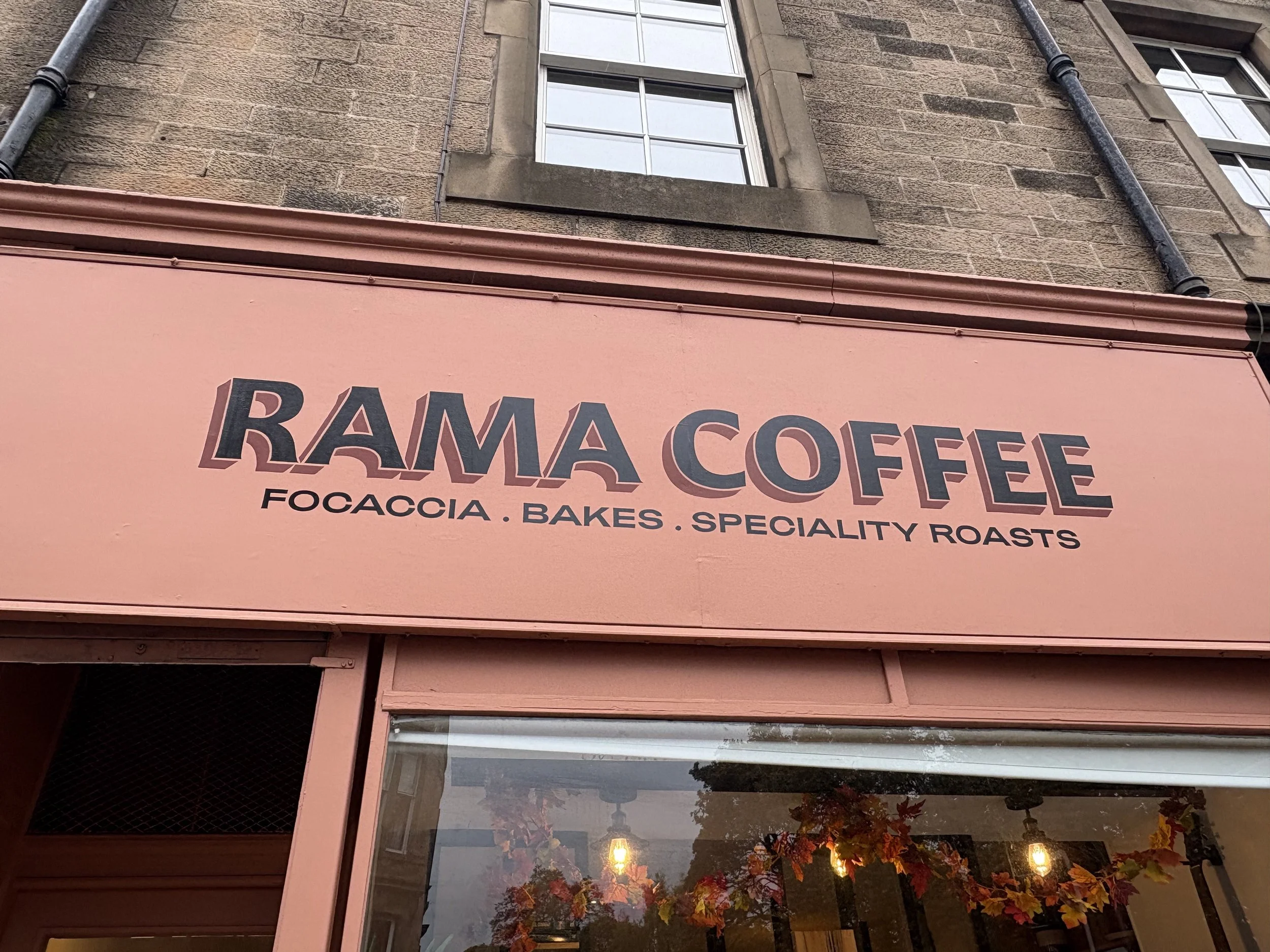
One of my favorite signs is a local coffee shop called Rama Coffee. They specialize in both incredible coffee and delicious baked good. Their overall vibe is of quality, culture (it is filled with books and instruments), and vibrancy (plants, open space with lots of sunlight). The storefront and sign communicates that well with a striking and sophisticated palette of peachy-pink background, with not quite black lettering and a complimentary brownish-red for the shadowing. The type itself also feels really refined with the pronounce curves on the underside of the A and the leg of the R, all of which comes together in a nice composition that tells you not only that it is a coffee shop, but also that you can expect some good food as well.
There is a lot to love about Edinburgh’s built environment. It has incredible architecture in its churches, government buildings, monuments and university buildings. But I really do love the small details and differentiation of the humble shop fronts. It is a wonderful reminder that beauty and design don’t need to be grand or generational investments. Sometimes it can just be a way for a small business owner to communicate their pride in what they’ve built and to set themselves apart from their neighbors. It is an inspiring example of how everyone has the capacity to enliven and enrich their communities with human scale beauty.
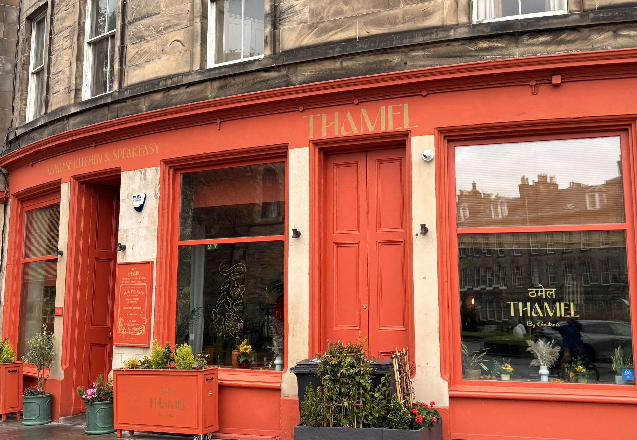
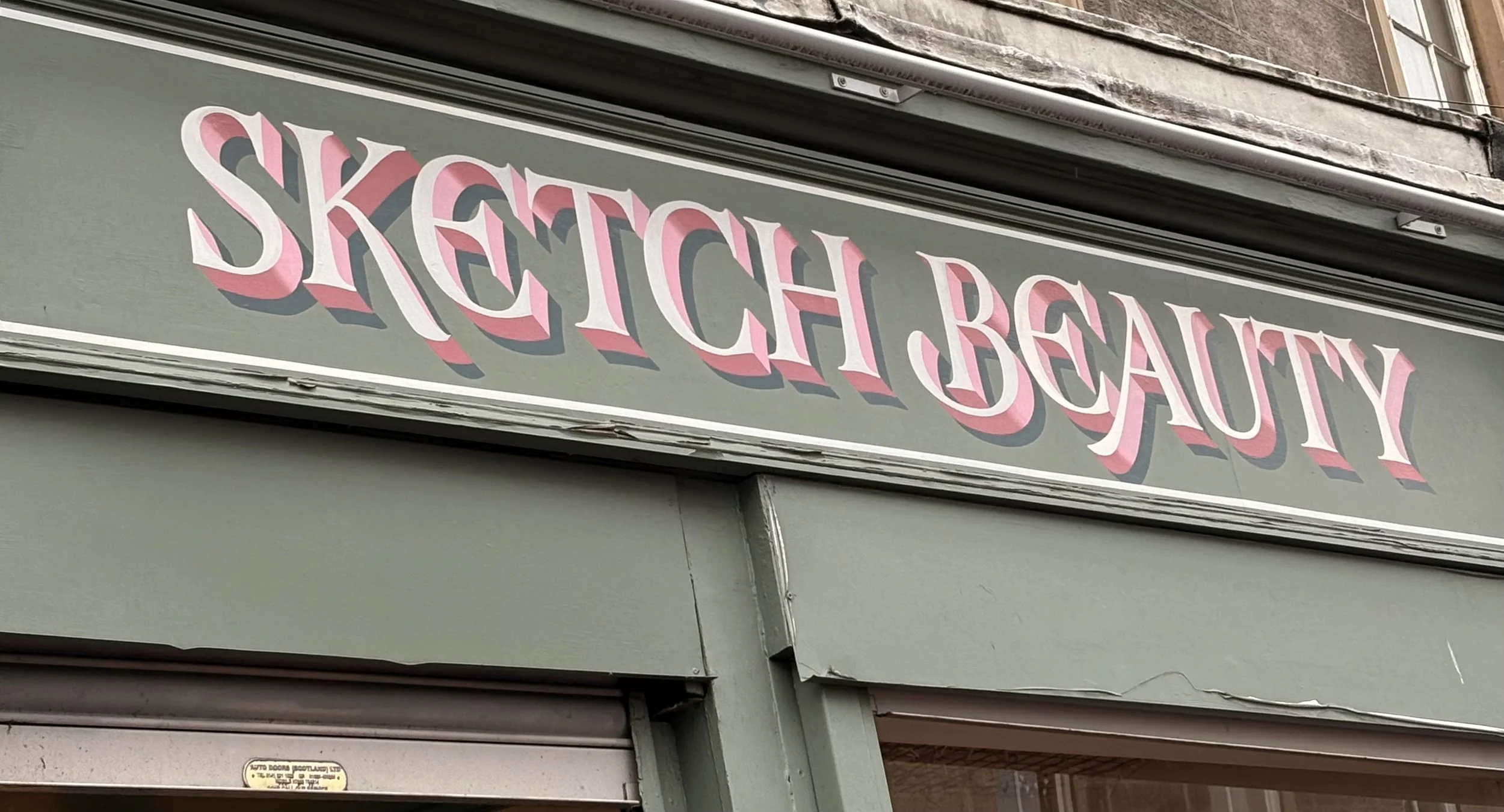
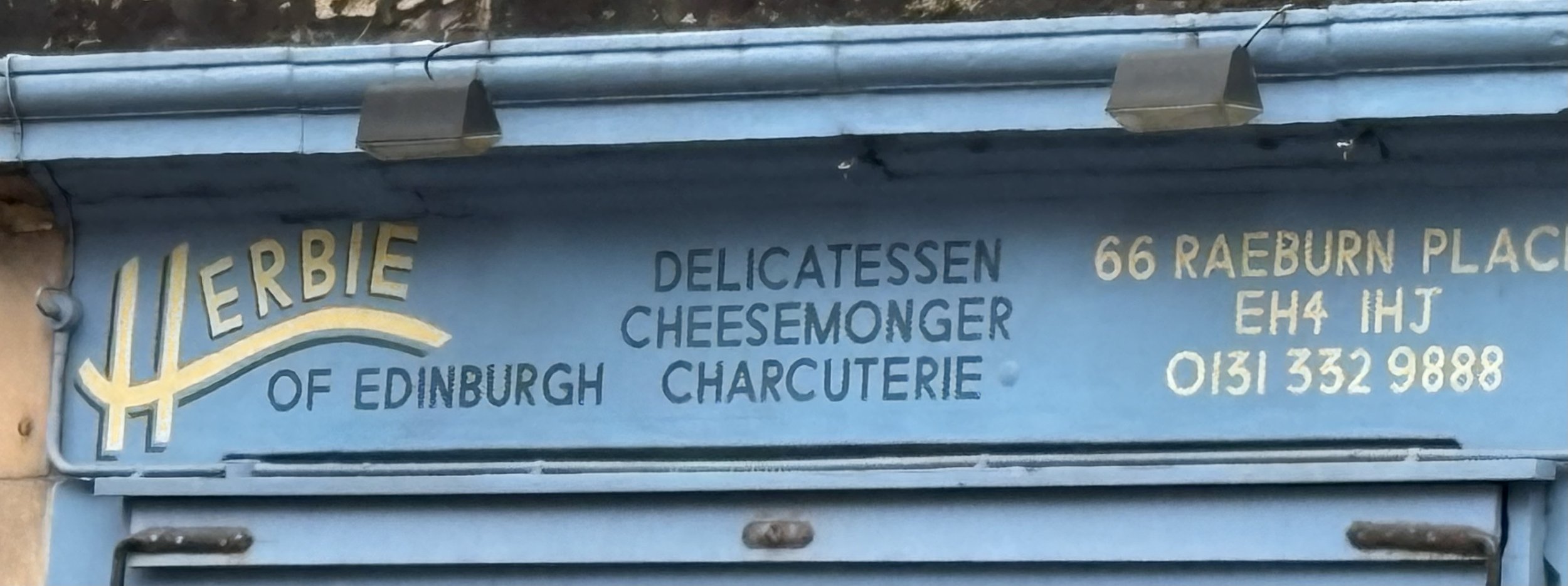
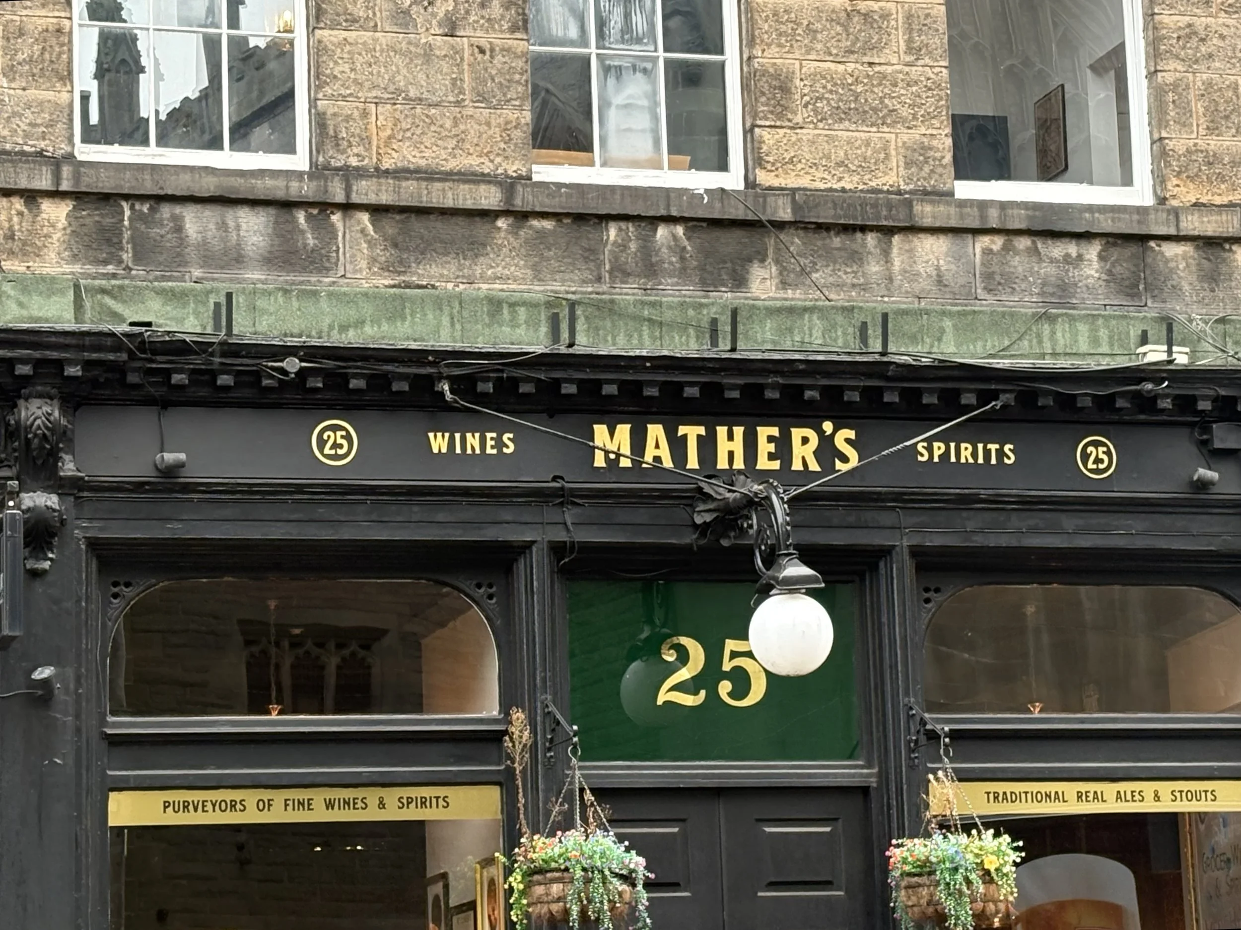
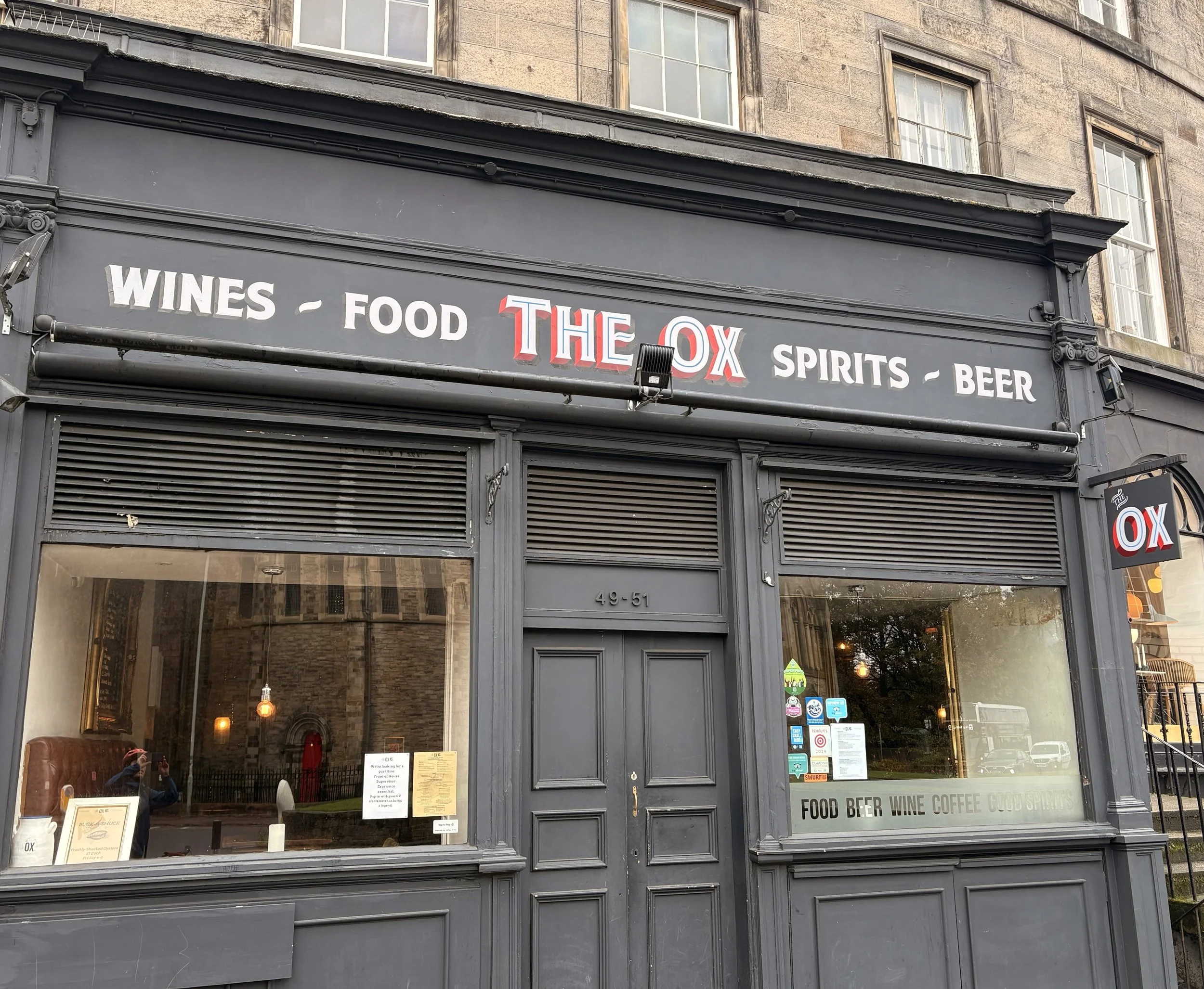
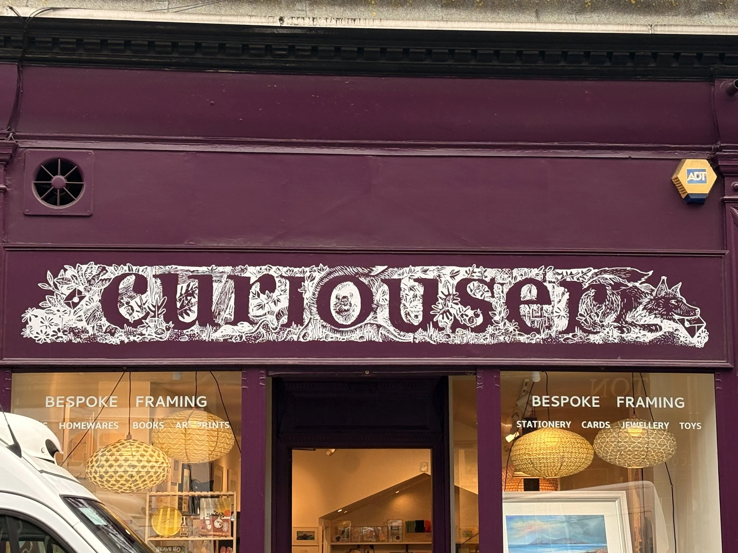
Before I leave off, here are some of my other favorites that I have seen around town. It is only a small sampling, but should give a good view into how varied and interesting the craft of painted signs is in this city: