

I Saw the Signs
I recently uprooted from Seattle to Edinburgh and have been struck daily by new and interesting details of this city that I love. One of the subtler characteristics that has caught my eye is how prevalent hand-painted signs are on Edinburgh’s shopfronts. To be sure, there are plenty of gaudy and loud plastic and backlit signs along the high-streets, but that scream is almost equaled out by the confident and quiet assertions of the many understated and unique hand painted signs.
As I discussed in the first post of this blog, I recently uprooted from Seattle to Edinburgh. There is a lot about the two places that are pretty similar: the mix of hills and sea, the dark and wet winters, the toned-down pallettes of the locals’ wardrobes. There is also, obviously, quite a bit that distinguishes my new home (900 year old city in Scotland) from my old one (~120 year old city in the Pacific Northwest). One of the subtler characteristics that has caught my eye is how prevalent hand-painted signs are on Edinburgh’s shopfronts. To be sure, there are plenty of gaudy and loud plastic and backlit signs along the high-streets, but that scream is almost equaled out by the confident and quiet assertions of the many understated and unique hand painted signs.
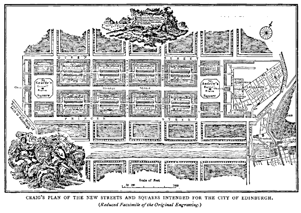
James Craig’s New Town Plan Source: Old and New Edinburgh, Vol. III, Ch. 16 http://www.oldandnewedinburgh.co.uk/volume3/page129.html |Author =James Craig |Date =18th century
What I love about these signs is their timelessness and graceful simplicity and how perfectly that aligns with the character of Edinburgh. As mentioned earlier, Edinburgh is OLD. And as an old city, it has many of the characteristics you would expect: decidedly non-grid layout, layers upon layers of monuments/placards/memorials, cobbled streets, and a charming patina of wear and decay that reminds you that she exists in a different scale of time than we do. But there is also another side of Edinburgh that is strikingly not that. This Edinburgh is intricately planned and gracefully executed as embodied in massive undertaking such as Edinburgh’s New Town or the thoughtfully constructed Water of Leith walkways that connect distant corners of the city with verdant and clean paths. The intermixing of this feel of being grounded in something ancient and traditional while also having elements of more contemporary design-thinking is perfectly encapsulated in the use of simple paint to communicate and entice modern shoppers and diners into a store or restaurant.
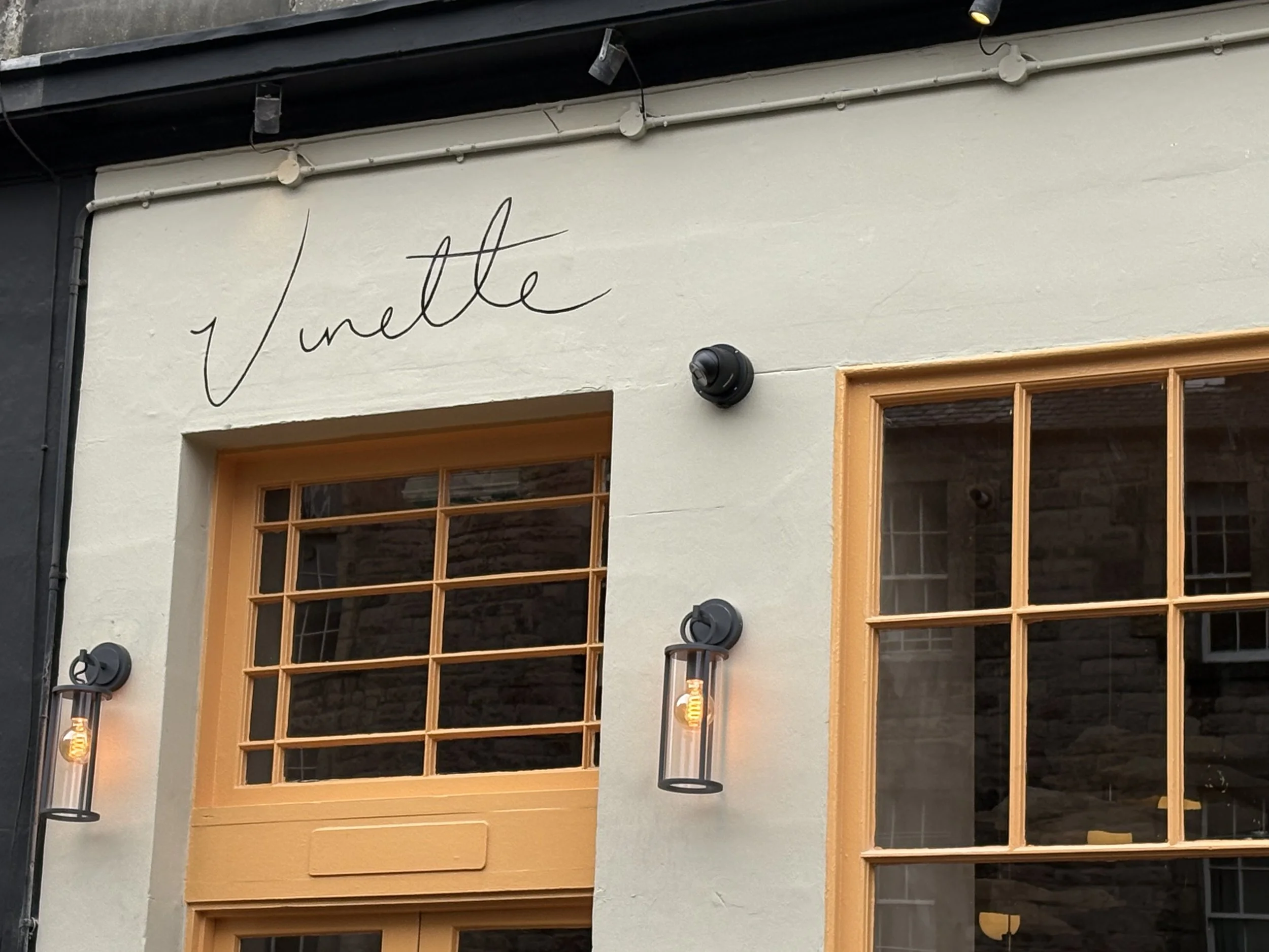
Vinette uses minimal paint to express maximal personality.
The signs themselves are, with few exceptions, composed solely of color+text, with the occasional flourish of iconography. With these limited elements, businesses have found ways to perfectly capture the personality of their establishment and hint at the experience you can expect within. Take, for example, the front of the high-end french restaurant Vinette. Their design is built around an audaciously confident understatement. They have an entire field to work with and they make their mark with the lightest lined scribble of their name, leaving the rest of the empty space be. Seeing this, one can easily imagine a menu of sumptuous dishes that reach gustatory heights, not with pomp or frivolity, but with a cultivated palette of simple, top-quality ingredients put together with creativity and gusto.
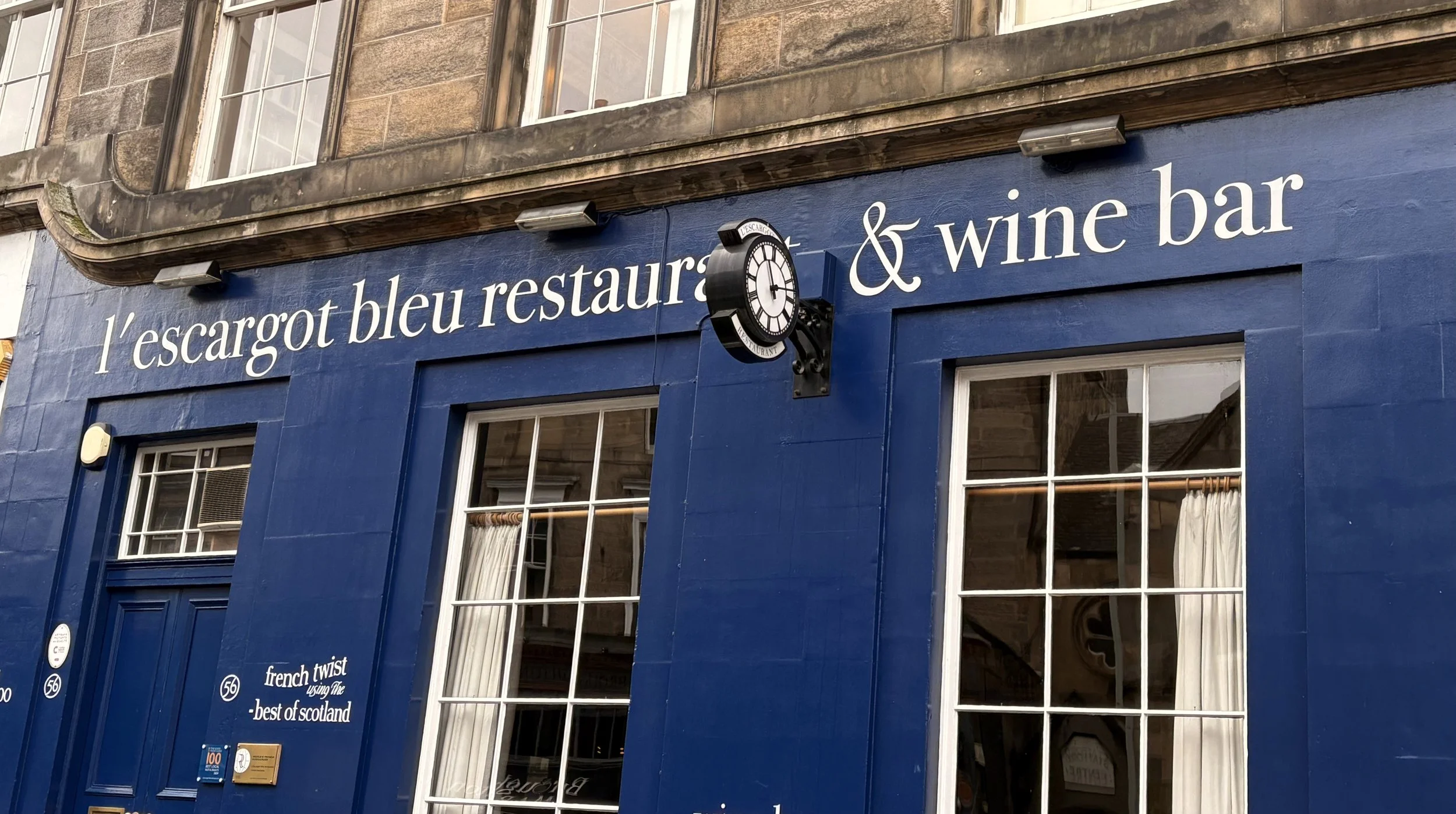
Contrast this modern, almost cheeky minimalism with another French Restaurant, l’escargot bleu, who are using the same basic elements of color and typography, but immediately tell a different story. The conservative and stately look of the painted sign signal that when you step into the doors, you will be transported to an environment of classic Francophile delights. It’s hewing to traditional aesthetics also prepares you for a meal that similarly works within the confines of classic French cuisine, focusing on craft and perfect execution, as compared to Vinette’s look which implies a bit more playfulness and willingness to experiment and push some boundaries.
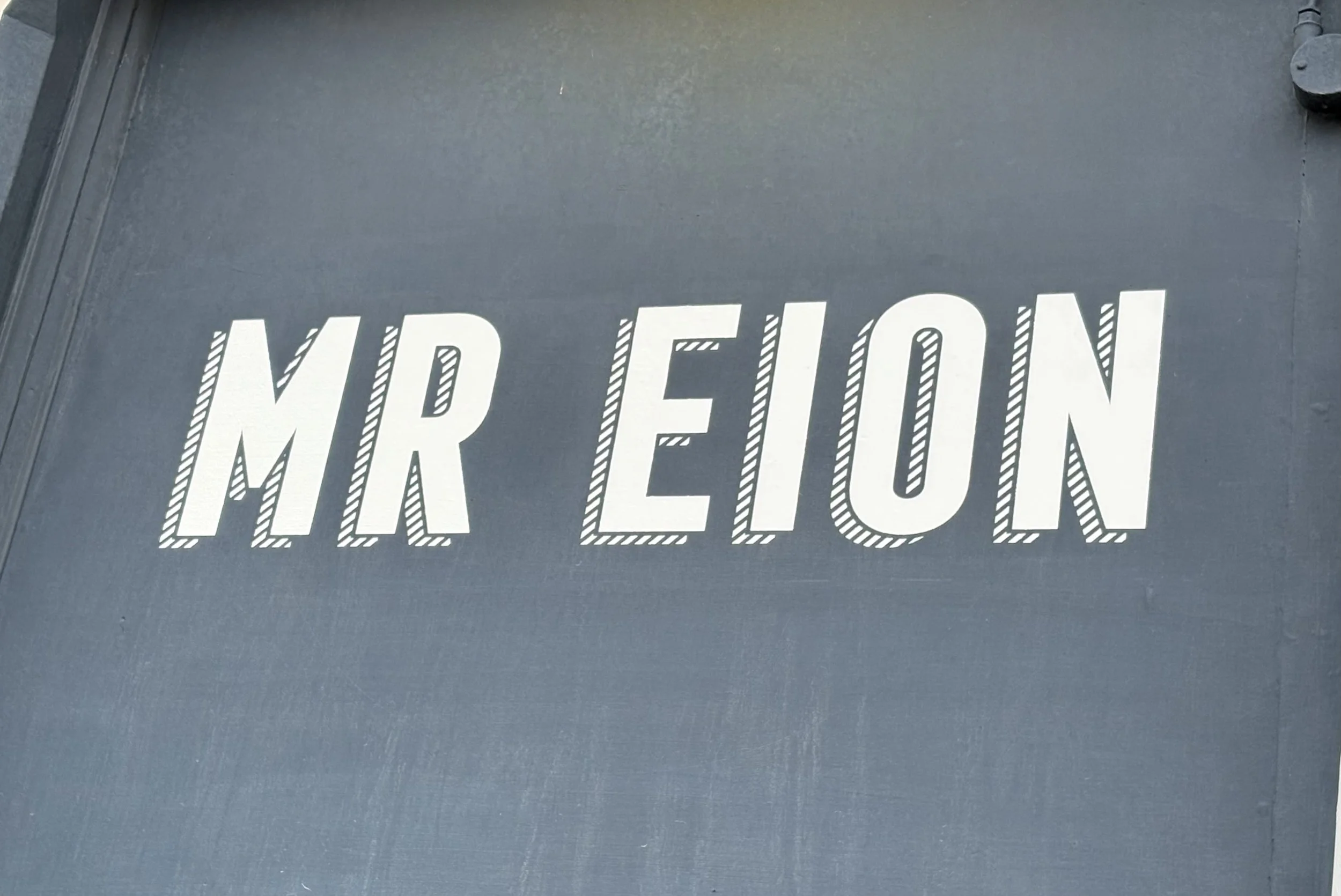
While the signage of these restaurants have many contrasting visual characteristics, they both also have a look that says “pounds will be spent.” They both go after it in a different way, but the front of these establishments hammer home that this is a place of refinement and should be respected as such. This is in contrast to what I see a lot with the coffee shops around Edinburgh, which are other businesses that tend to use their signs to good, yet different effect. True to the overall sophisticated, yet contemporary vibe of coffee shops, the best of these signs are also design-forward but with a look that is more approachable and fun. MR EION is a good example of this. It is clear that thought went into the design, with it’s chonky, leaning font and striped offset shadow, but the effect is to make a customer feel like they are going to partake in a fun and modern coffee experience (pour overs, single-origin beans, angular modern furniture) as approachable luxury.

Hopetown Coffee does something very similar with it’s signage. It also uses a blocky modern font but instead of stylizing with a shadow, it uses a simple outline box as a subtle flourish. Taken with the colorful and playful window design, it gives off a welcome and warm feel that is inviting and cheery which perfectly compliments their business model as a non-profit that “allow(s) people to purchase their daily coffee and cake knowing that their money is going directly to helping people affected by poor mental health.”
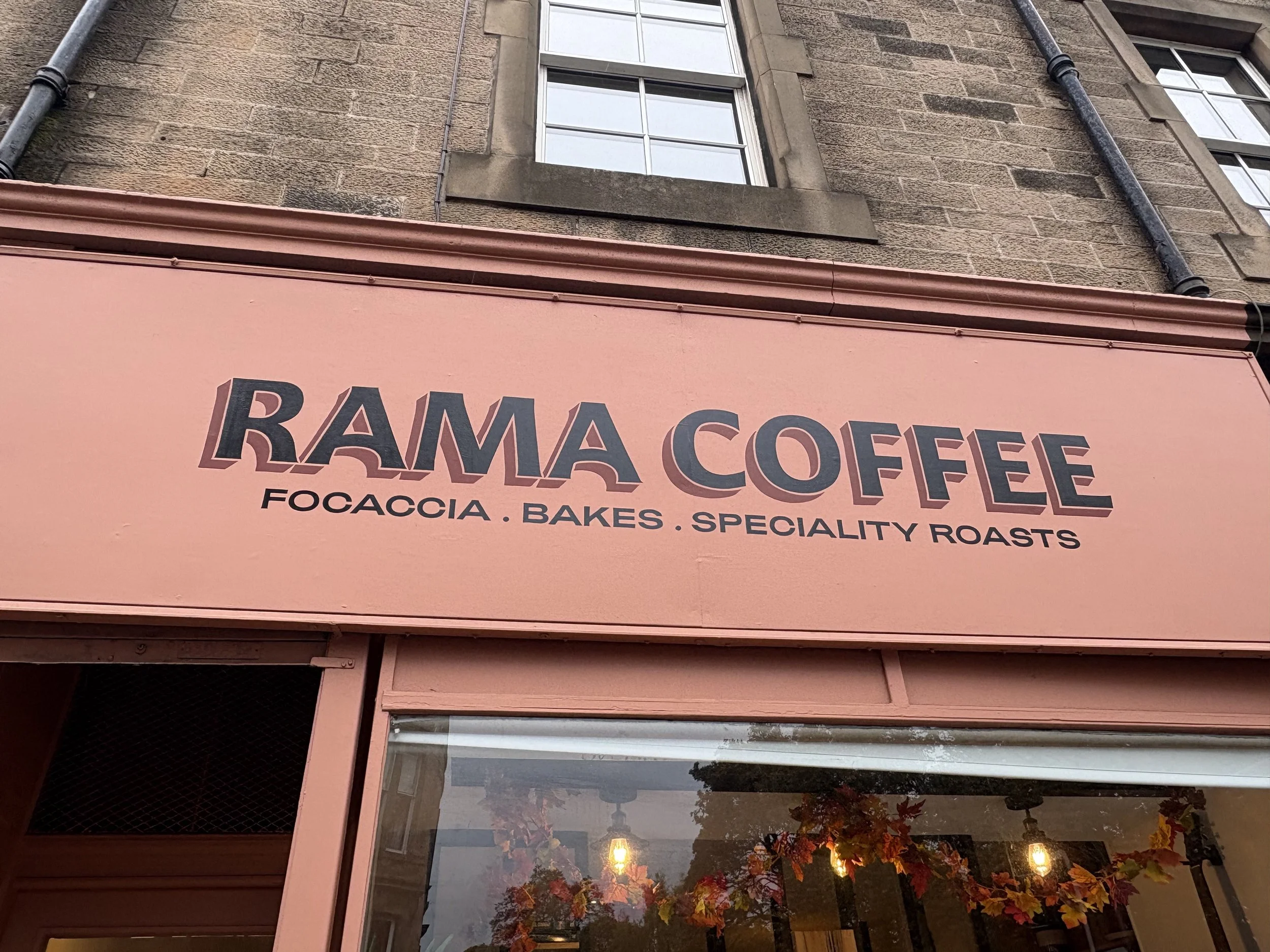
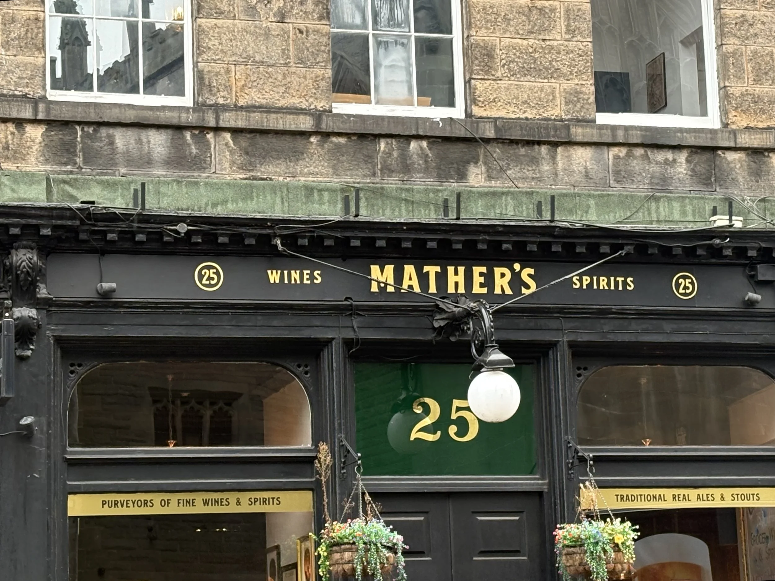
One of my favorite signs is a local coffee shop called Rama Coffee. They specialize in both incredible coffee and delicious baked good. Their overall vibe is of quality, culture (it is filled with books and instruments), and vibrancy (plants, open space with lots of sunlight). The storefront and sign communicates that well with a striking and sophisticated palette of peachy-pink background, with not quite black lettering and a complimentary brownish-red for the shadowing. The type itself also feels really refined with the pronounce curves on the underside of the A and the leg of the R, all of which comes together in a nice composition that tells you not only that it is a coffee shop, but also that you can expect some good food as well.
There is a lot to love about Edinburgh’s built environment. It has incredible architecture in its churches, government buildings, monuments and university buildings. But I really do love the small details and differentiation of the humble shop fronts. It is a wonderful reminder that beauty and design don’t need to be grand or generational investments. Sometimes it can just be a way for a small business owner to communicate their pride in what they’ve built and to set themselves apart from their neighbors. It is an inspiring example of how everyone has the capacity to enliven and enrich their communities with human scale beauty.
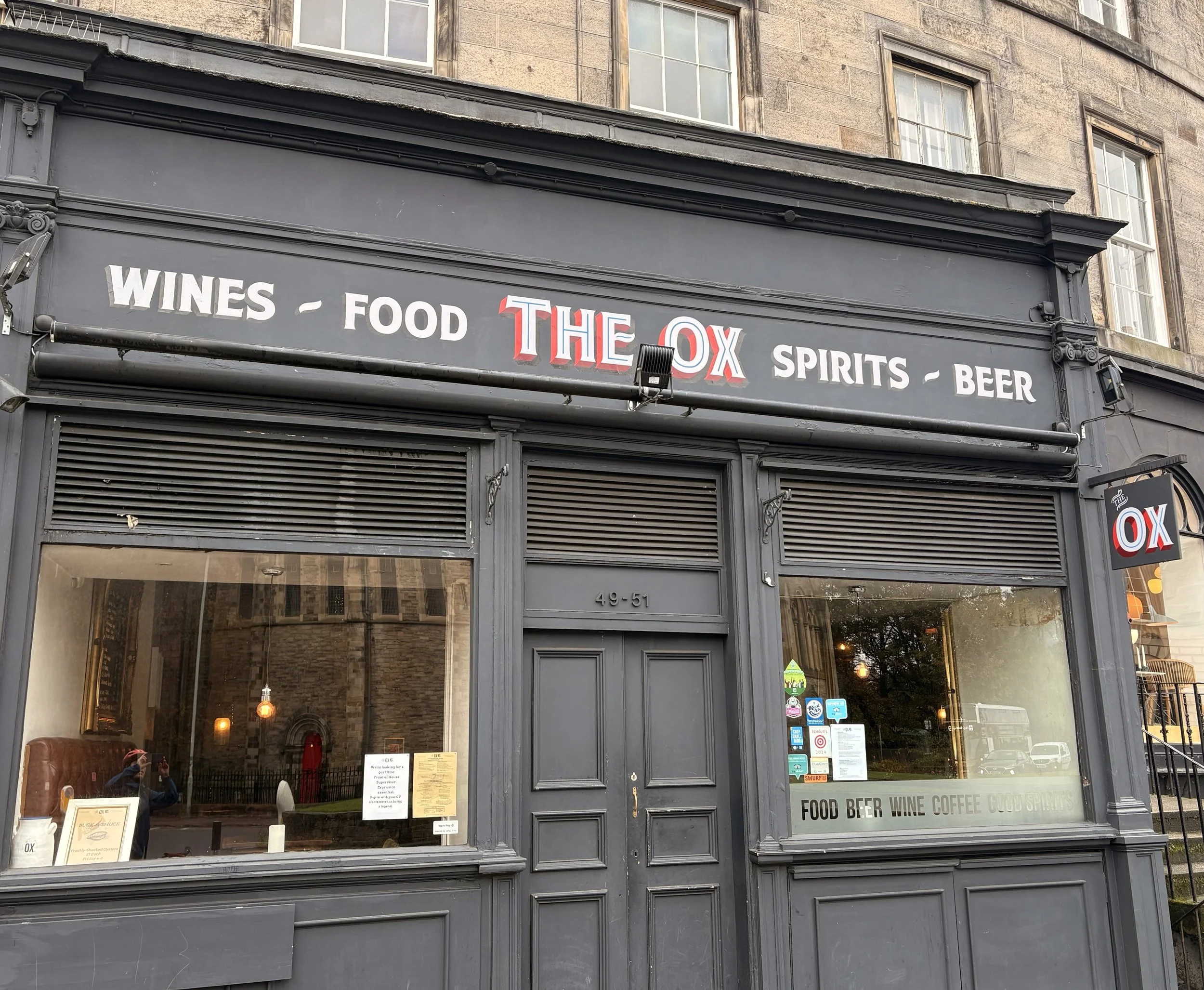
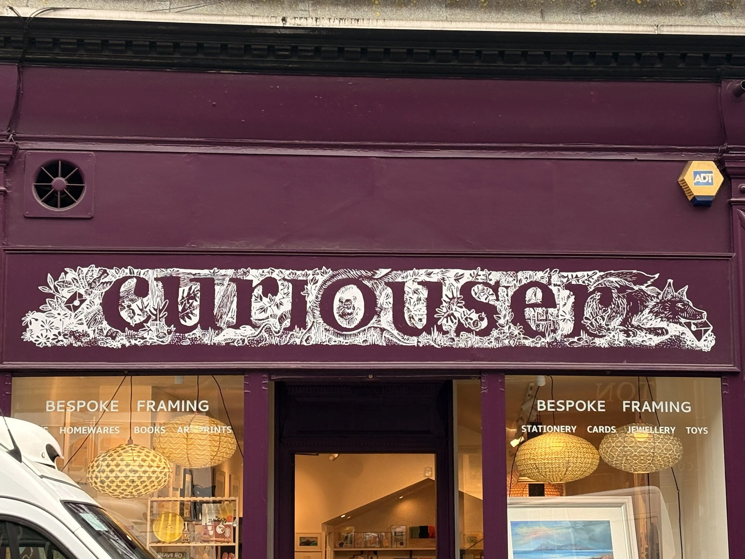
Before I leave off, here are some of my other favorites that I have seen around town. It is only a small sampling, but should give a good view into how varied and interesting the craft of painted signs is in this city:
Puzzle Counter Pt. 3: Reflections on AI and Design
It has been a fun few weeks getting to know some of the latest AI tools through my work on the puzzle counter app (Part 1, Part 2). I will use this post to venture some guesses about how this will affect product development, with a specific focus on how it will change design. It was eye-opening to see how quickly the tools at our disposal have evolved from beguilingly smart tchotchkes into meaningful collaborators for the complex task of product design.
Not necessarily great patterns, but serves to stretch my thinking and expand the realm of ideas.
It has been a fun few weeks getting to know some of the latest AI tools through my work on the puzzle counter app (Part 1, Part 2). I will use this post to venture some guesses about how this will affect product development, with a specific focus on how it will change design. It was eye-opening to see how quickly the tools at our disposal have evolved from beguilingly smart tchotchkes into meaningful collaborators for the complex task of product design. I can say with certainty that the availability of AI will change design workflows across the board from one-person operations to the largest organizations and, if done correctly, will lead to faster turnaround of every aspect of the design process.
I started the project imagining that I would use AI as another tool that I could slot into my existing workflows to produce a better output. What I found instead, was that in many cases, I would use AI to up-level my existing processes (more iterations, more and faster input from AI “experts”, quicker path to prototypes and code), but it would also make certain steps less necessary as AI tends to tackle many things at once (e.g. visuals+motion+interactivity+code). We will still need to rely on user research, deliberate analysis and design processes, and the expertise of others, but with AI there will be great potential to:
Combine Steps: Ability to tackle multiple steps at the same time (e.g. visuals, layout, flows, motion)
Speed Up Iteration Cycles: Using prompts to get multiple divergent options in the earlier stages, and quickly change things I don’t like as I move towards prototypes and final design
Providing Pre-Feedback: Asking AI to serve as a stand-in for other team-members (product partners, engineering) to pre-vet and tighten-up designs ahead of team reviews
Going forward, I will absolutely be using AI in my work. AI will enable me to do what I have always done, only now will have a virtual team of “experts” to aid me in every step that I do. As I have been thinking about this, I have begun to think of these “experts” as falling into one of three categories:
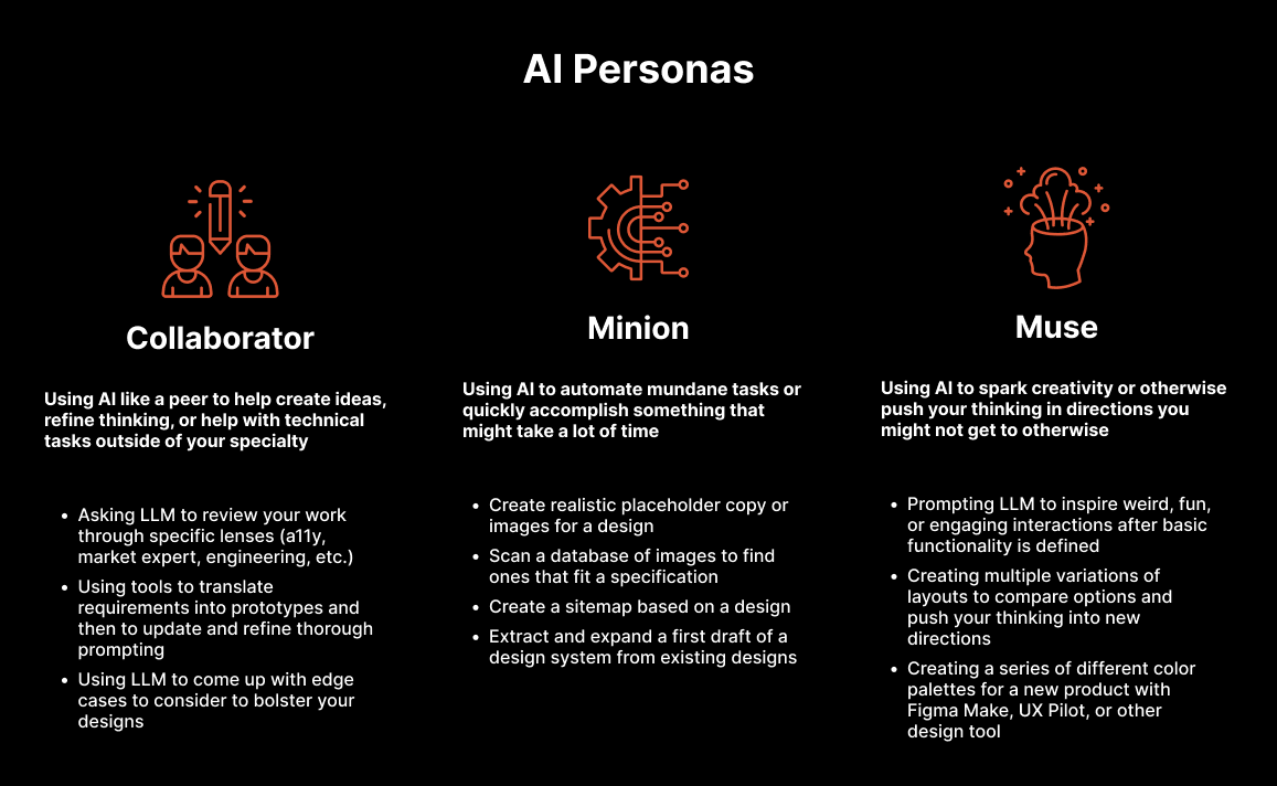
Collaborator: Using AI like a peer to help create ideas, refine thinking, or help with technical tasks outside of your specialty
Asking LLM to review your work through specific lenses (a11y, market expert, engineering, etc.)
Using tools to translate requirements into prototypes and then to update and refine thorough prompting
Using LLM to come up with edge cases to consider to bolster your designs
Minion: Using AI to automate mundane tasks or quickly accomplish something that might take a lot of time
Create realistic placeholder copy or images for a design
Scan a database of images to find ones that fit a specification
Create a sitemap based on a design
Muse: Using AI to spark creativity or otherwise push your thinking in directions you might not get to otherwise
Creating a series of different color palettes for a new product with Figma Make, UX Pilot, or other design tool
Prompting LLM to inspire weird, fun, or engaging interactions after basic functionality is defined
Creating multiple variations of layouts to compare options and push your thinking into new directions
Thoughts on the Future of Design
In my more optimistic moments, I think AI’s effect on design might be similar to what happened with the advent of cheaper and more accessible audio and video tools. The proliferation of cameras, microphones, and nearly free audio and video editing software led to the rise of talented amateurs who could now turn their ideas into high-quality songs, podcasts, videos, etc. outside the gated confines of the traditional systems of production and distribution. This evolution didn’t necessarily signal an end to the large organizations that traditionally held the keys, or destroy the craft of audio and video creation, but it did mean that there was some lane for the upstart who was maybe a bit weirder or a few years ahead of the gatekeepers.
I can see a world where something similar happens with product development. AI can provide a quick and cheap collaborator to fill any gaps in knowledge, understanding or skill an individual or team might have. A designer who has a great app idea but doesn’t have deep business or engineering experience, could use AI tools to refine their ideas, check their market assumptions, and sketch out product requirements with a Claude/ChatGPT/etc., and then once they’ve created the designs that they want use one of the many AI development tools to build the app, all without the need of a full team of experts. Similarly, an engineer who doesn’t have much experience in product management or design could develop their idea and vibe code their way towards a successful product.
As for larger organizations, I have no illusions that there are CEOs out there who will use AI-based downsizing as chum for a quick Wallstreet bump. However I am hopeful that, in the end, what will result is not the full-scale diminishment of product, design, and engineering expertise, but rather, a tightening of cycles and more meaningful collaboration and communication as each specialist will be able to quickly venture into the others’ worlds to bridge understanding gaps. I envision cases where a product manager using their AI-assisted PRD to create a quick prototype can then hand off to design to refine and improve user flows, visual design, and design systems before working with dev to solidify stability, efficiency, security, privacy, etc. Or for engineering to quickly spin up a high-polish prototype of a more performant alternative flow/design to guide conversations with product and design to quickly resolve issues and inefficiencies with the original design.
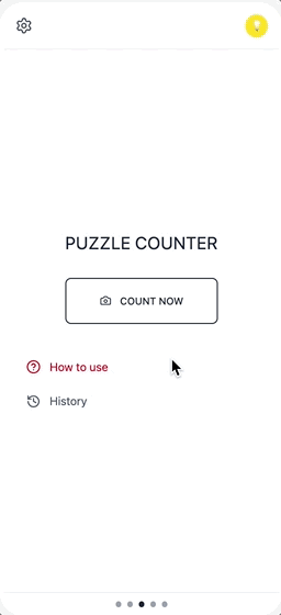
Puzzle Counter Pt. 2: Putting it All Together (Visuals, Interaction, Prototypes)
This post promises to be a shorter one. I realized pretty quickly into this stage that my assumptions about how this process would work end-to-end were not correct. I imagined that once I had some sets of wireframes from the initial explorations, I would import those into a tool and voila they would import and provide a the tools necessary to create, edit, and apply a cohesive design system. In reality, this didn’t seem to be the way most tools worked, likely for the best, since there are more straightforward workflows available.
This post promises to be a shorter one. I realized pretty quickly into this stage that my assumptions about how this process would work end-to-end were not correct. I imagined that once I had some sets of wireframes from the initial explorations, I would import those into a tool and voila they would import and provide a the tools necessary to create, edit, and apply a cohesive design system. In reality, this didn’t seem to be the way most tools worked, likely for the best, since there are more straightforward workflows available.
The Old Ways Are Not the New WaysAs anticipated, the best path to a good end result for AI does not necessarily mimic what we have always done…but with AI. Wireframing in an llm will continue being helpful for ideation but the actual layout for a design can be done just as well in modern AI coders or Figma with Make.
I explored a handful of options for trying to carry my previous work forward and none of them really did exactly what I was looking for, namely converting wireframes into full visual comps and a design system. Instead they tended go straight to prototypes with full code, and in most cases had limited abilities to use a set of wireframes as a starting point.
So I will use this post to walk through the progress I was able to make by using both Figma and Lovable to prompt my way towards the look, feel, and interaction i was looking for. Ultimately, I was able to use both tools to create fairly refined and semi (will go through this later) elegant designs for the app.
I will start with a brief overview of the two tools and their capabilities:
Lovable
Description: Lovable is an AI-powered app development platform that lets users create full-stack applications from natural language prompts without needing to write code. There are a number of tools that work similarly (Replit, Bolt, etc.) but Lovable kept coming up in my reading so seemed like a good place to start.
Capabilities: natural language prompting (front end, backend, db), instant previews, Figma import, free plan
What it Did Well: The coding was obviously the bread and butter for Lovable. It was really impressive to me that I was able to use my phone camera for the capture automatically.
What It Struggled With: Design polish was the biggest issue. It didn’t do a great job following my prompts to get the color scheme I was looking for. In real life this might not be too big of an issue as I would create the design system separately rather than trying to define that as I created the functionality, but it was noticeably worse than Figma.
Figma AI
Description: Figma has begun to integrate some pretty cool features for quickly spinning up designs (First Draft, Make an Image, Figma Make) and using static designs or prompts to create working prototypes (Figma Make). Figma Make turned out to be the only tool that I could find that would directly turn my ASCII wireframes into a prototype, so I was able to test that flow and could image it could be useful if I landed on something great in early Claude ideation.
Capabilities: natural language prompting for designs and rudimentary code, instant previews, Figma import and export (you can turn , free plan
What it Did Well: Figma Make’s output was quite a bit more polished than what I found with Lovable, and it was able to turn most of my prompts into approximately what I was looking for in visual design, motion, etc.
What It Struggled With: Creating and modifying my Puzzle Piece icon, updating the capture area to the correct side (common issue across both).
Lovable
I had hoped that Lovable would allow me to upload some rudimentary wireframes that I had already refined and it would then spit out a nice prototype based on that. This would have aligned nicely with what I had done so far and built off of what I had already done. However, there didn’t really seem to be a way to do that, so I decided to just start from scratch in the tool.

Initial PromptI used the same starting prompt I had done for the original wireframes to see what the differences were, beyond the obvious of higher fidelity and working code at the end.
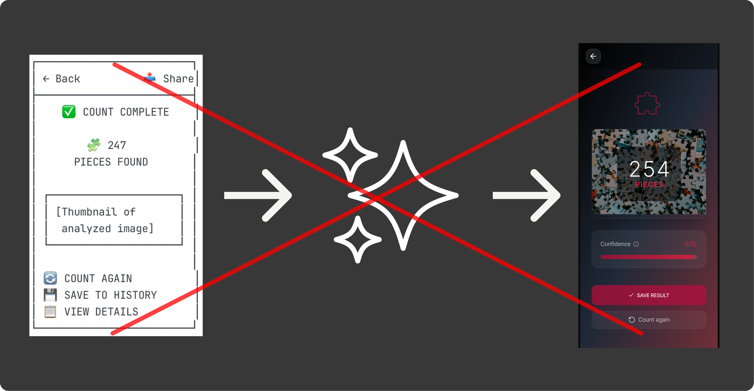
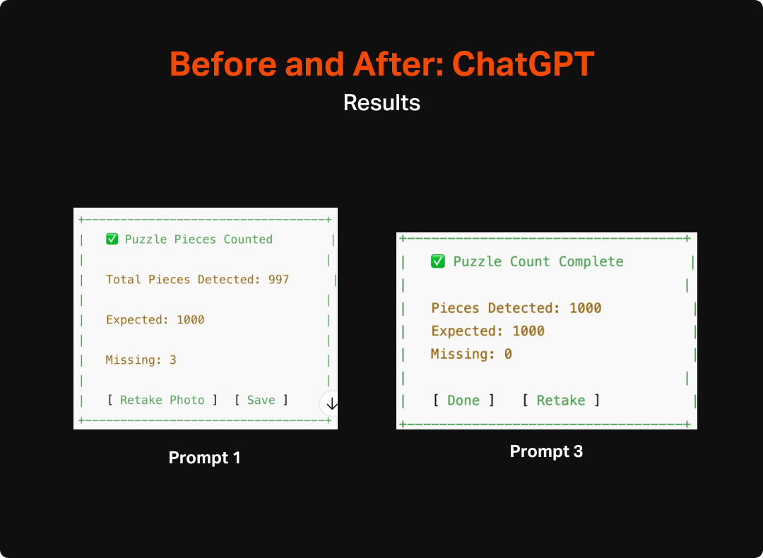
The outcome I got was….okay. The technical side was pretty impressive. It created a working prototype that even connected to my phone camera, that presumably (not a dev and didn’t dig too deep here) had the building blocks for a working, shippable app. However, the UX was kinda rough. The user is dropped into a very rudimentary looking capture screen with odd layout, a flashing message at the top, the auto-capture hides the image that will be taken, an odd “reset option” and there are a lot of redundant messages that make it feel really busy. It really didn’t fee like an app as much as a homespun utility, which for 5 minutes of work is still very impressive, but not what I was expecting based on hype and previous experience with tools like it.

Sometimes a V0 Really Feels Like a V0The first version had a lot of the basic features I was looking for, but needed some work.
I then continued to refine the functionality, look and feel, layout, and add pages and features to the app over the next couple of days as my free daily tokens re-upped. Overall it was easy to guide the machine and I had very few instances of having to revert, instead it felt like I was making consistent, incremental improvements similar to quick-version design.
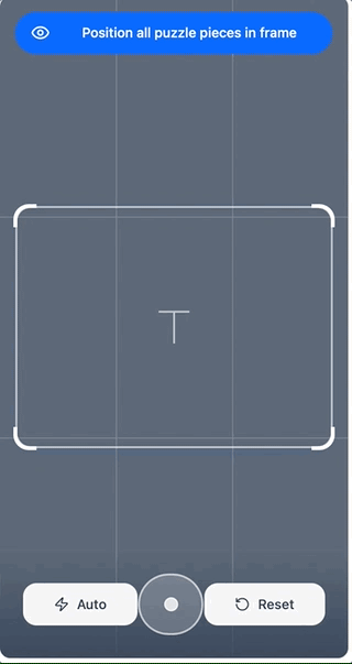
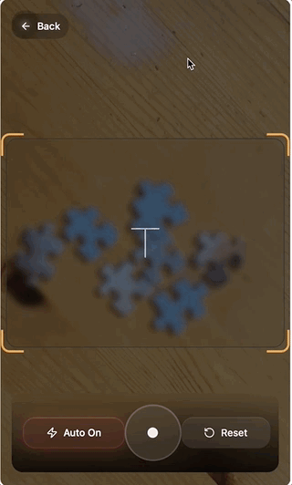
I worked on expanding the functionality to feel like a real app, editing down some of the content, adjusting features (remove redundant toast, remove “reset button” and layout, and visual design updates for both polish (glassy styling) and functionality (make the capture area clear instead of blurred. I tended to work by making one or two large prompts to get make big leaps, and then follow up prompts as I reviewed what had been done and saw things that didn’t work. All-in-all, this was a pretty fast and effective method, though ran into some issues that took longer than others like the size of the capture area and the visual styling of the app
The visual styling itself was one of the most problematic, though also one of the easiest to solve since a paid subscription allows for direct editing of the code which would give me much more precision and speed for getting things looking exactly as I want.
After several hours (over a course of a few days due to daily token limits) I was able to refine the app pretty well. The basic functionality of initiating the capture, taking a photo, and getting results and confidence was all there. Additionally, the visual design was pretty good, though I kinda threw up my hands after several prompts trying to brighten things up a bit and reduce the sludginess. Again, this is something that I would handle differently anyway, as I don’t think ad hoc prompts is the right way to define app visuals and design system, but something to note as far as limitations.
Figma
The other tool that I used was Figma, which had two features that seemed promising. The first was First Draft, which allows you to create and edit designs through prompts. This seemed like it could provide a pretty good path to a more polished version of the puzzle app, though without necessarily building off of what I had already done. I will go into very short detail on this, as I ultimately gave up quickly since it seemed pretty underbaked.
I approached the prompts for First Draft similarly to how I had done in other tools, and expected that the outcome would be a relatively high-polish experience that I could build off of. However, the result felt really wire-framey and even when I tried to prompt it into attractiveness it failed. Additionally, it was limited to a single screen at a time, which also made it a poor option for building out a full featured, coordinated app.

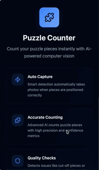
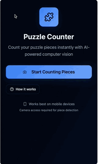
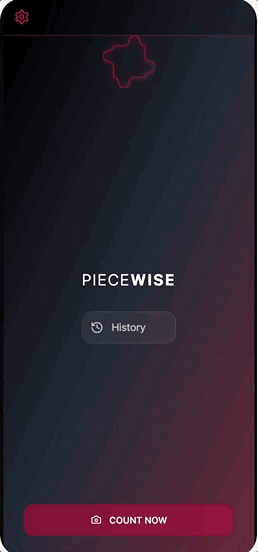
I quickly moved on to Figma Make as a potential option for building up the fidelity of my app design. I was glad I did. Figma Make quickly created an interactive prototype based on my existing Claude wireframes and a short prompt to put the images into context.
The initial version was pretty simple, but retained much of the layout and intention of the original one, creating a pretty basic end-to-end prototype that could then be refined via prompts to improve the styling, layout, and functionality.
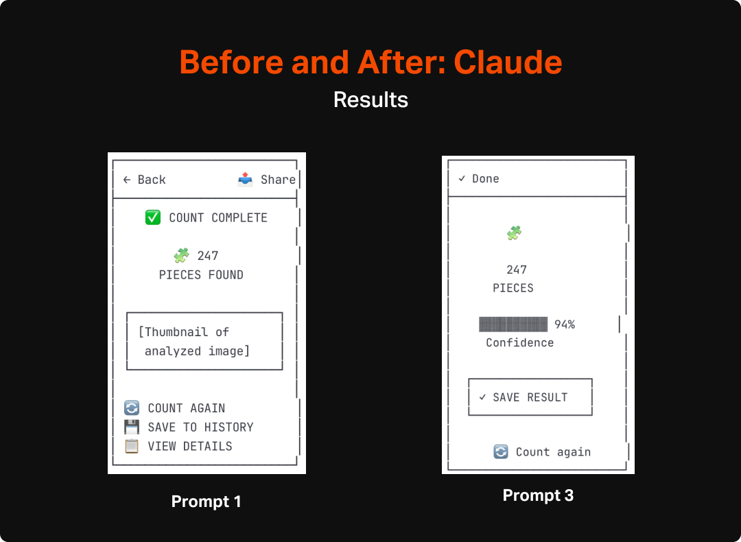
I Rate it V0.5Figma Make’s v0 was quite a bit better than what I got from Lovable. The ability to upload images as a starting point really helped solidify my intent from the get-go.
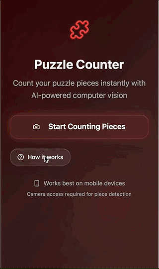
With such a solid starting point, I was able to quickly iterate on the specifics of the experience and design system. In the course of a few hours I modified the experience to a very fine degree. Figma Make was really good at making minor adjustments to the visual styling (glass design, specific red hues, etc.), animations (back sliding animation, image capture transitions, etc.), layout (lots of iterating on the capture screen to feel right), and even spinning up new pages (saved counts).
I found prompting the tool to do what I want to be really easy. It felt very similar to times when I would work with a dev or design technologist to get things just right. I would prompt something like:
“Add a smoother transition for the loading screen. Thinking a .3s ease-in with a subsequent ease out when it ends.”
I could then review what had been done and make adjustments as I needed to. In the future, one thing I would do differently is to give a bit more explicit instructions, particularly when I expected changes to affect multiple contexts. There were a few times when components that I felt were basically the same (e.g. results screen and history screen) that didn’t get updated when I prompted a change to one and not the other.
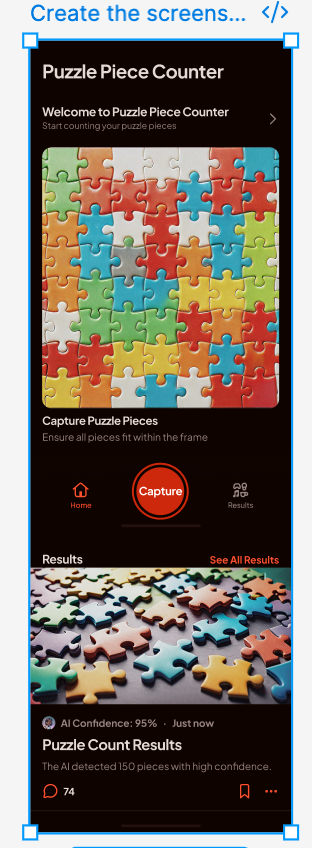
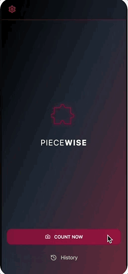
In the end, I was able to create a design that felt cohesive, polished, and tuned to the goals of the user. There are certain things I would refine prior to going to delivery (fine tune the capture flow, update icons and loaders, etc.), but ultimately the output from Figma Make allowed me to get really close really quickly.
Final VersionFigma Make was impressive in it’s ability to create and refine highly-polished designs.
I will leave it off with that. I will continue working on the app, but might leave it here with some last thoughts next week, since building the entire experience will require a decent amount of model training to have anything I would consider releasing into the wild. So coming up next will be my thoughts on the process I went through, and what I would do differently in future projects, including how it might be different depending on context (e.g. freelance project, design at big org with dev resources, etc.
Puzzle Counter Pt 1: Gathering the Pieces (Wireframes, Structure, Layout)
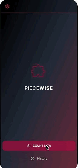
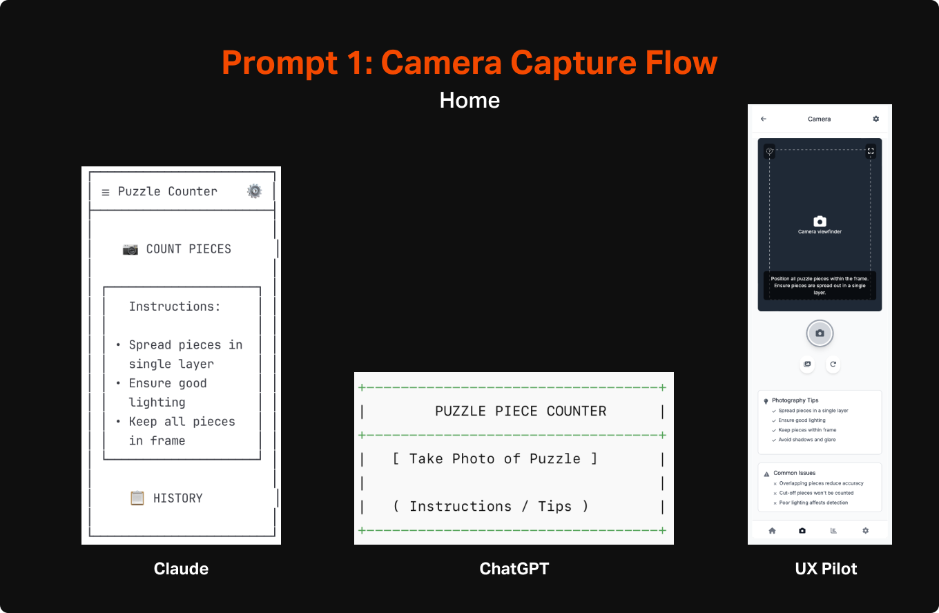
For this first step I wanted to try a few different tools to begin to understand the tools that are out there and have a few data points to compare the output of each. For wireframing, I used two general LLMs (Claude and Chat GPT) and one design-specific tool (UX Pilot). For Claude and ChatGPT I used a method of creating simplified and efficient ASCII wireframes.... For my specific goals, I was especially interested in the performance of the general LLMs since they were obviously not built with design in mind.

Tools
For this first step I wanted to try a few different tools to begin to understand the tools that are out there and have a few data points to compare the output of each. For wireframing, I used two general LLMs (Claude and Chat GPT) and one design-specific tool (UX Pilot). For Claude and ChatGPT I used a method of creating simplified and efficient ASCII wireframes that I learned from a guest post by Nimisha Patil from the Design with AI Substack. For my specific goals, I was especially interested in the performance of the general LLMs since they were obviously not built with design in mind, and should thereby give a pretty good sense of how endangered all of our jobs are. If a general use LLM, without special training in design, could effectively work out layout, page flows, interactive elements, etc. then there is no doubt disruption is around the corner (spoiler alert: they did pretty well 😭).
Chat GPT
Version: 5
First Impression: Of the 3, it was the least sophisticated in making wireframes. It lacked a lot of detail you would expect, such as navigation and thoughtful layout. However, this is not to say that it didn’t do a reasonable job of identifying the most important elements to have on each page and a general sense of how the pieces fit together.
Claude
Version: Sonnet 4
First Impression: Claude’s wireframes were considerably better than Chat GPT. Each screen captured rudimentary (they were ASCII after all) layout and also included navigational elements that communicated indirectly how the entire app would work.
*UX Pilot
Version: Standard Model - May 2025
First Impression: Unsurprisingly UX Pilot’s output was significantly more refined looking than either of the LLMs, however the actual substance of the designs weren’t any better. In fact, of the 3, it was the only one that needed me to designate the type of app (mobile vs desktop) prior to creating designs rather than relying on context clues. This likely is a product of it requiring tokens for creation, but seems like something an AI could have figured out without direct definition.
*I created and iterated less in UX Pilot given the cost. At a future date, will explore bespoke design tools more deeply, but for now wanted to include it as a bit of a supplement to the general AI investigation.
Process
Step 1: Initial Prompts
I used the same initial prompt for each of the 3 tools. I kept things purposefully general to truly test where each model went left to its own devices. I was interested to see how well they each did with:
Identifying user needs and the features to satisfy these
Organizing the features into appropriate layout and hierarchy on the page
Developing an overall structure for a cohesive app
The specific prompt that I used (though removed ASCII language for UX pilot) was:
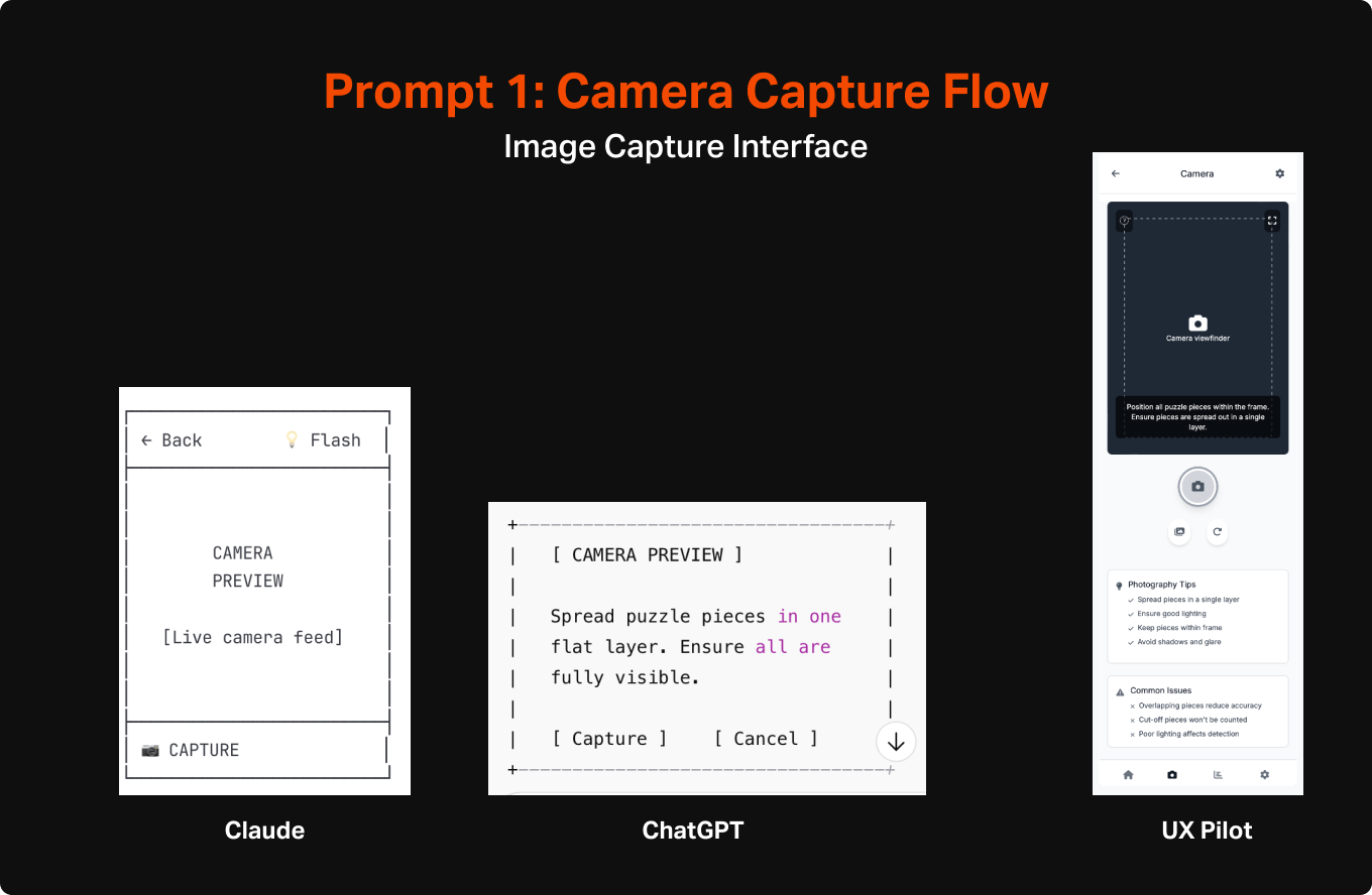
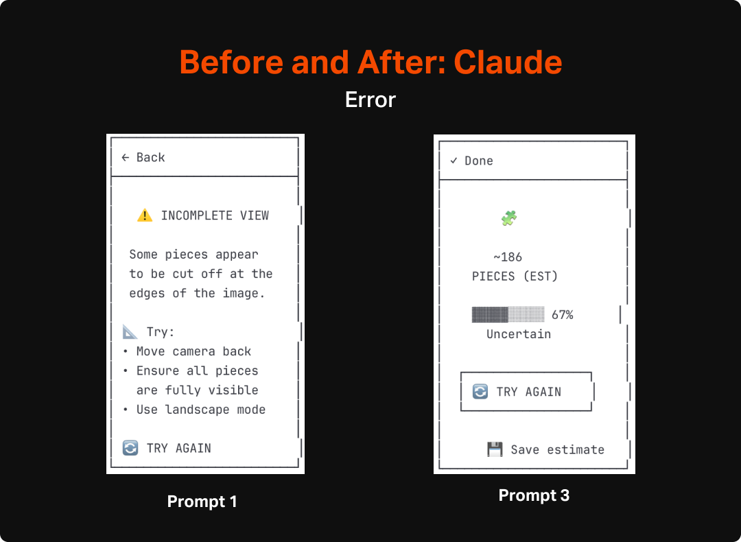
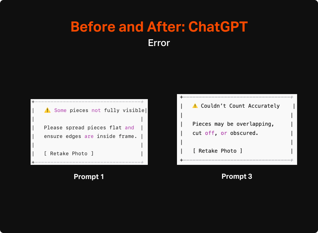
can you create ascii wireframe flows for a mobile app that will take pictures of puzzle pieces to count them to ensure the puzzle is complete. The most important things are for it to be able to view all of the pieces when they are spread out in one layer, assess how many there are, and display the count after counting is complete. It should also be able to give feedback when it is unable to work due to issues like pieces being obscured or cut off. Please also help me identify any other issues that might occur that would need intervention and messaging to ensure the trust of the user is maintained.
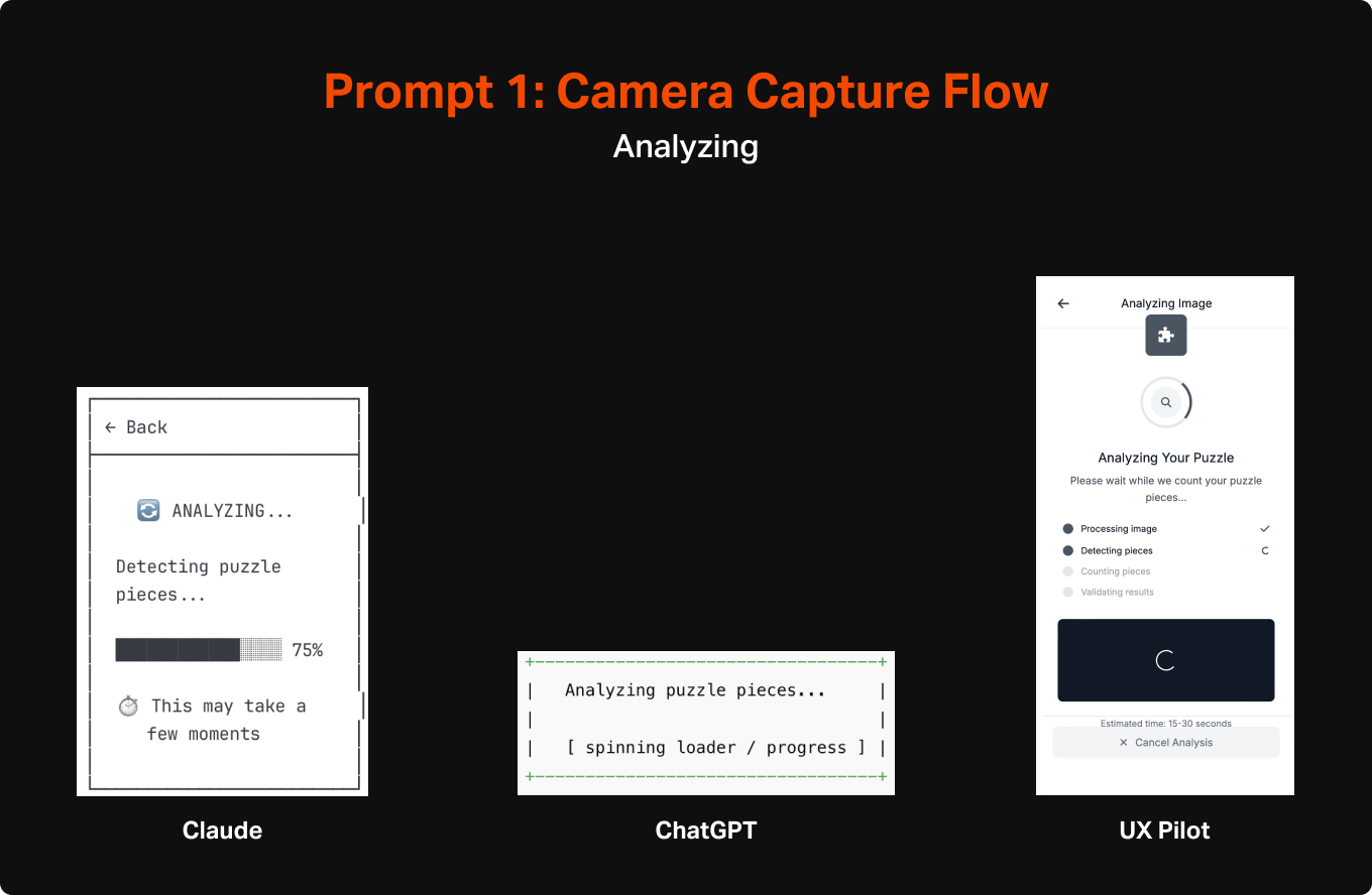
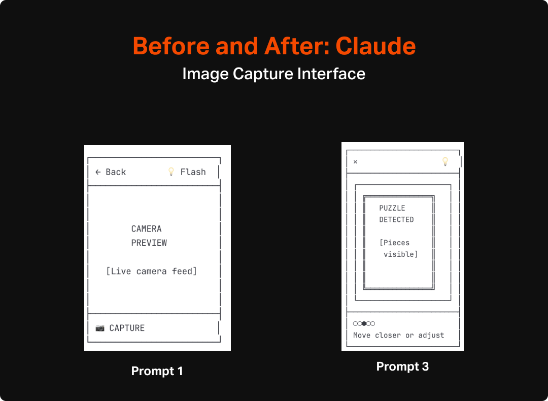
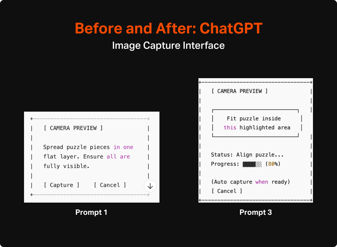
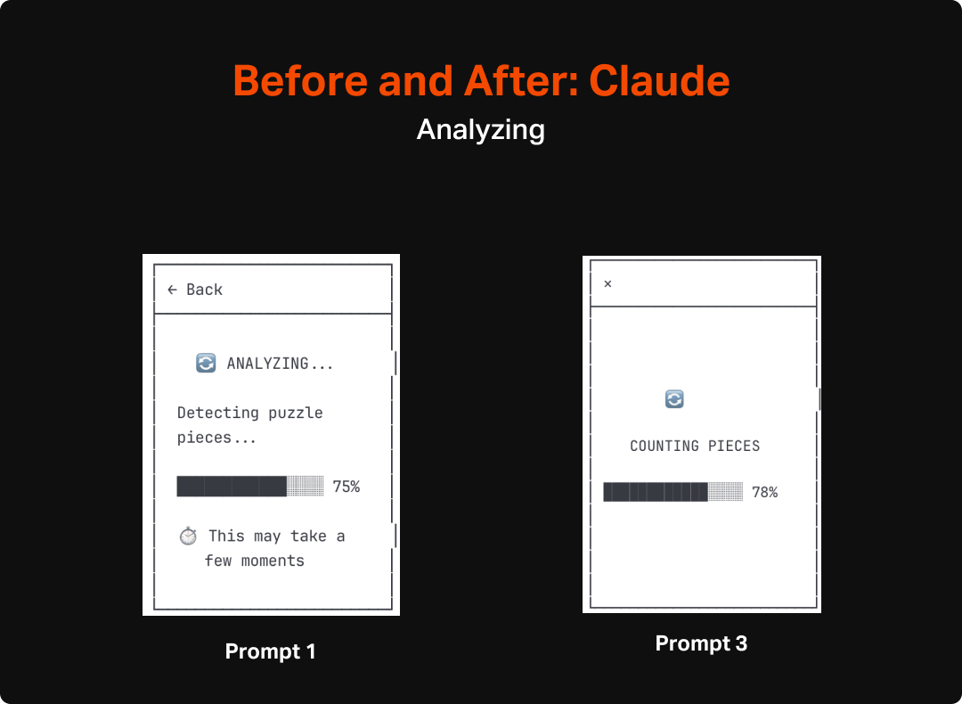
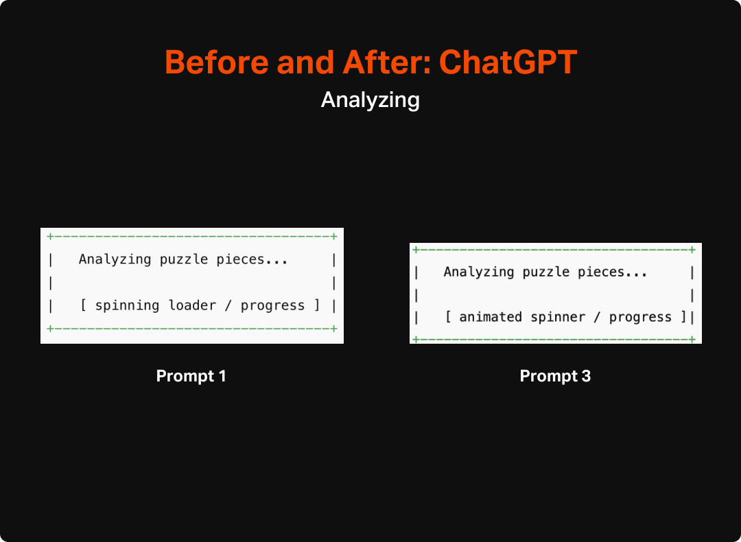
The output from these were overall surprisingly good, across all 3 systems. It felt on par with what I would expect from a week or two of work by a design intern, but with AI it was executed within a minute. The level of detail differed across them, but each version seemed to identify the same general set of features, including CTA to initiate the capture mode, some instructional content to explain the purpose and how to use it, loading states, success states, and error states.
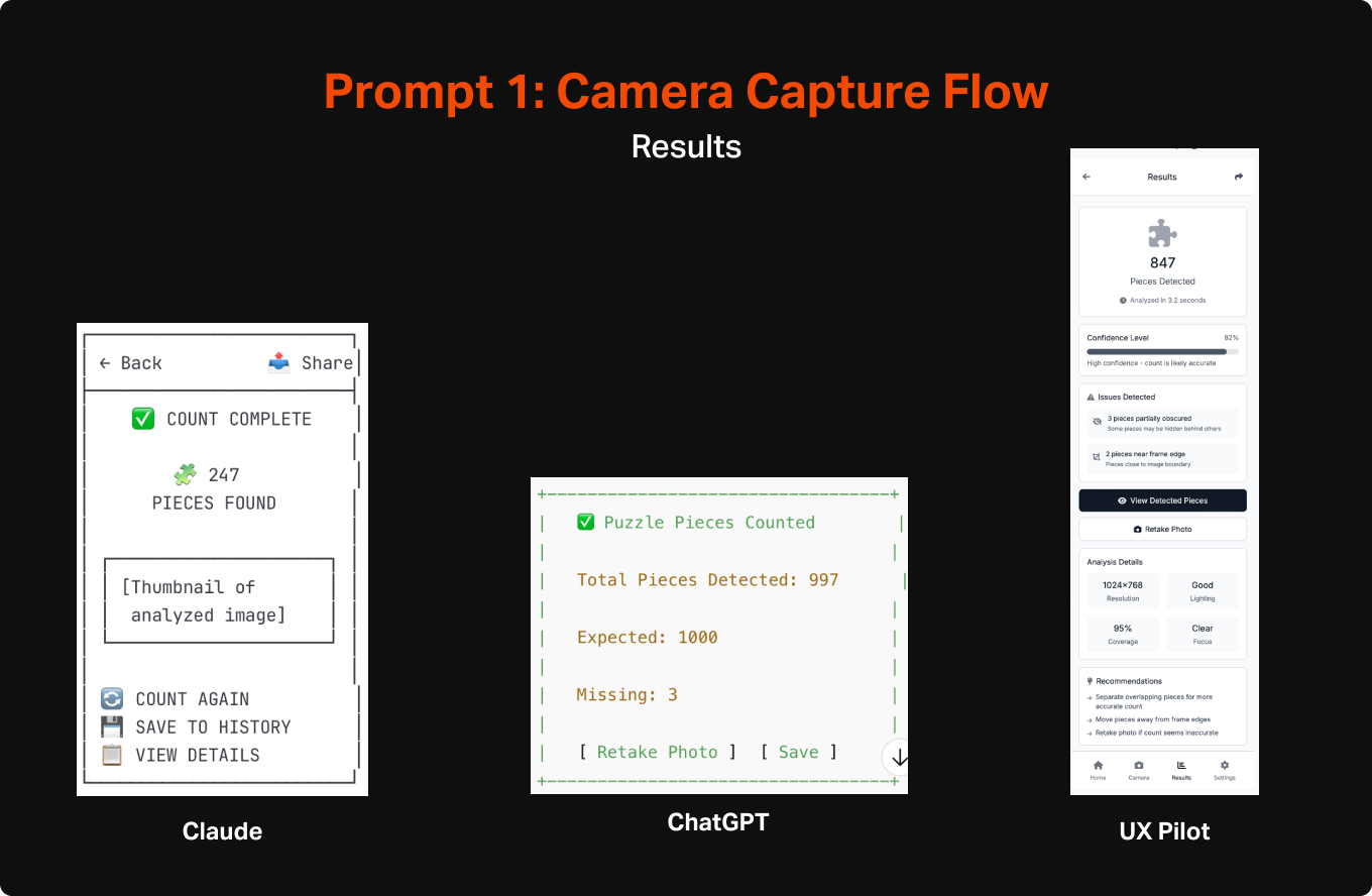
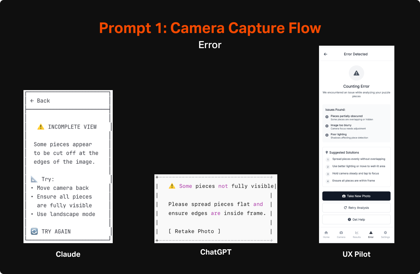
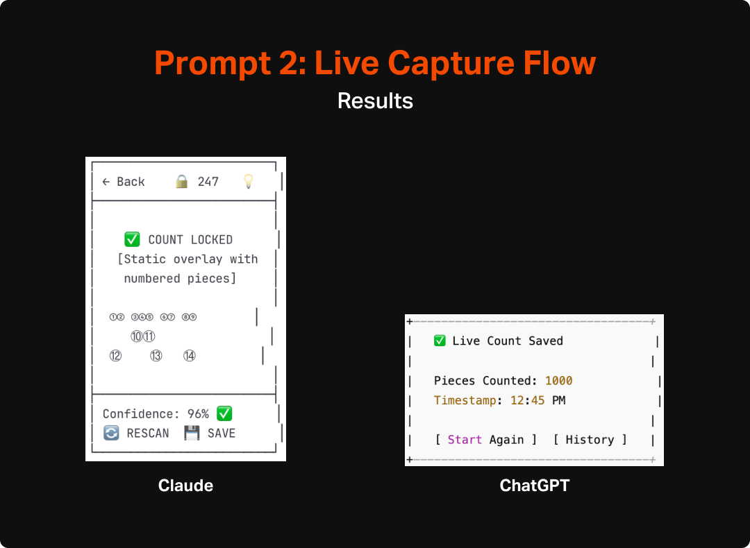
As an additional test, I asked the LLMs to do an additional version that assumed real-time counting. This would give me some additional insight into how the AI would react to a shift in scope, as well as provide some interesting fodder for thinking about how to make the most useful and engaging version of this tool. Both Claude and ChatGPT made pretty similar updates to their flows and UIs to account for the switch to real-time interaction. They both integrated a more explicit overlay that would highlight each area it interpreted as a “piece” as well as a mechanism for locking in the count and they also updated the language to make more sense with the new model (e.g. “lock count” instead of “capture” or “take photo”). Aside from the overlay and language though, the experience and structure of the app wasn’t much updated and unfortunately didn’t spark any additional fidelity from ChatGPT, which remained pretty void of detail or completeness.
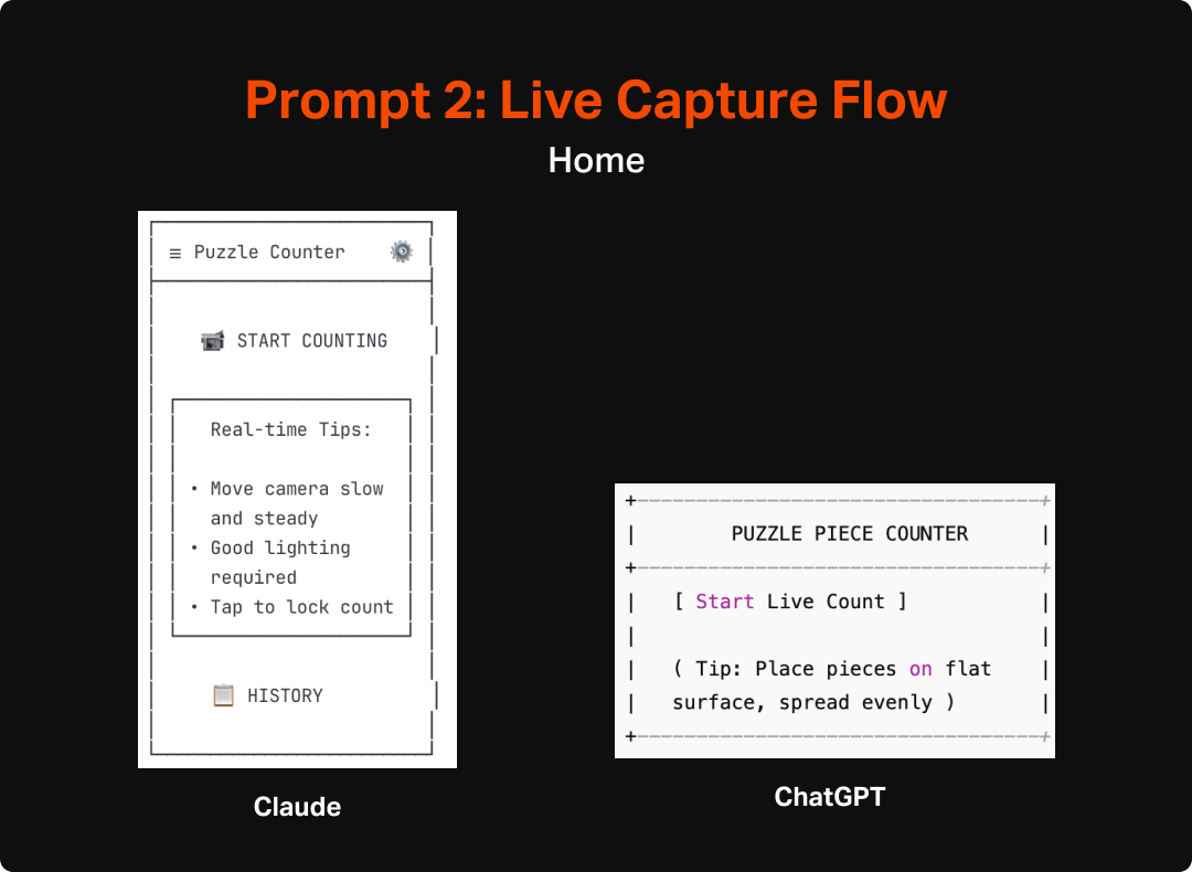
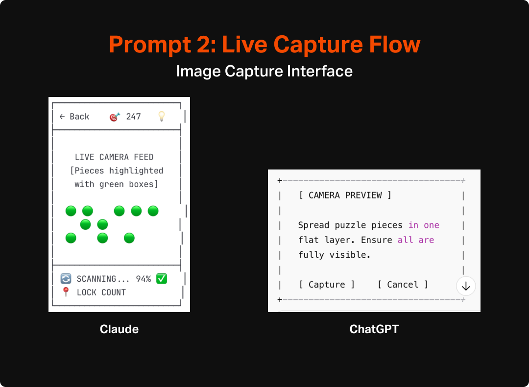
After reviewing the two sets of wireframes I decided that something closer to the original model would make more sense. I arrived at that decision after imagining how finicky a real time, constantly-updating version might be, particularly for anyone who might have any sort of tremor or wrist issues that would make it even harder to execute. Additionally it seems likely that a model like that would be much harder to code and take a lot of on-device processing to pull off. The second exploration did, however, inspire me to rethink the capture screen in the first version. It got me thinking about how this process was very similar to check-cashing interfaces in banking apps, which I have found to be easy to use with intuitive feedback. I integrated wording in the next prompts that implied as much which felt like a material improvement from the first version.
Step 2: Review and Mark Up
While the speedily constructed wireframes were a good starting point, it was immediately clear (as any it would be for any first draft) that there were refinements that needed to be made. I pulled the different outputs into a Figma file and made notes about the good, bad, and interesting aspects of the different designs to identify what aspects should be carried forward vs what I would change or cut altogether.


This process felt very much like flexing the same muscles I would in a critique or design review with a junior colleague. This was a little less interactive than I would like from an actual crit or review. In a real scenario when working with a team, I would probably operationalize this by having a more junior designer go through some iterations with the AI tool, and then have the interactive conversation with them about how they got to where they got to and then review the results together. This would provide a chance to collaborate on refinement around known user behaviors/needs and our business goals. This would also allow us to use the AI for what it is best at, namely quick ideation for a starting point, and then use the power of peer-to-peer collaboration to bring it back into the realm of purposeful and human-centered design.
“In a real scenario when working with a team, I would operationalize this by having a more junior designer go through some iterations with the AI tool, and then have the interactive conversation with them about how they got to where they got to and then review the results together.”
In this case, as it was just me and the LLMs, I later (after additional refinement) went back to the tools and asked them to better explain why different elements were there and what customer value they provided. This allowed me to learn a bit more about how they “thought” and start to understand the assumptions they were making and how true their understanding of user behavior was. This could also, in the absence of time/budget/headcount, help to clarify my own thoughts and assumptions and introduce some new ideas that could be considered in my design process. The end results tended to be pretty good. At both a page-level and element level, the rationale was pretty good. One caveat for this, and something I will test in future uses, is that I already refined the wireframes earlier with some guidance around simplification and user behavior, which might have affected the output. However, the articulation of purpose was still impressive. Here are a few examples of their replies:


The rationale provided by these LLMs largely aligned with my own assumptions and understanding of user needs. The only cases that seemed a bit off to me are some of the assumptions around individual features, particularly things like the history or supplementary explanation (tips, instructions, confidence levels, etc.). Some of these seemed to assume a much deeper engagement with the tool than I would expect (I definitely do not envision this being any sort of nostalgic look back at the puzzles users have done, especially since the photo would be of the unfinished state), but not outside of the realms of assumptions and ideas I would expect to come up in any early stage ideation.
Step 3: Re-Prompt and Refine
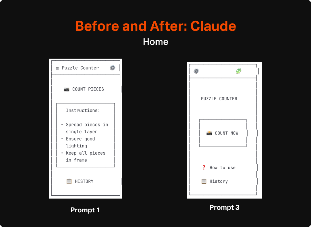
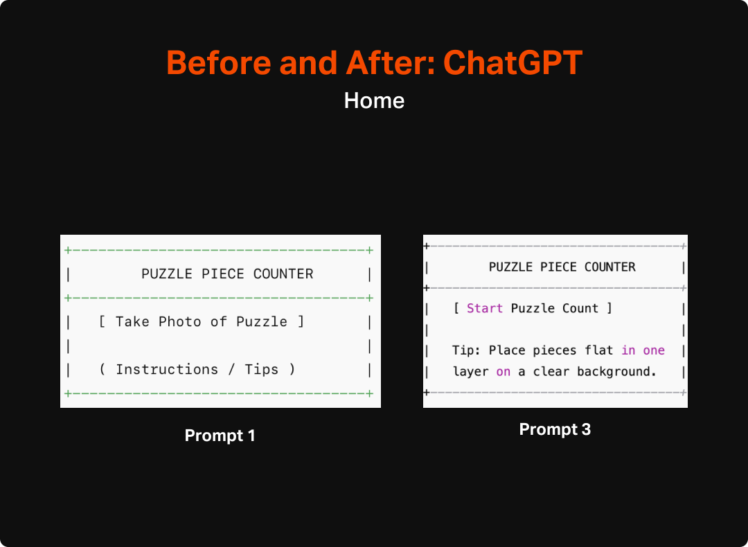
After reviewing the original output and identifying areas I wanted each LLM to refine, I moved on to testing how well they could be prompted into improving the wireframes. I crafted two slightly different versions of an “make these better” prompt, each tailored to the areas where I found the original set lacking. In the case of Claude, the focus was a bit more on simplifying since the original version was bloated with features and UI that was more distracting than helpful. In the case of Chat GPT I was hoping to get a more cohesive design rather than a series of discrete pages on top of also simplifying things.


The results of the refinement prompt were of mixed quality, and not really of higher-fidelity in any meaningful sense. ChatGPT’s updates were especially disappointing as it made very few changes to the original set beyond some slight wording shifts and the necessary updates to accommodate the Auto-Capture functionality I requested. Most troublingly, it failed to add any additional navigation, despite my explicit request for that specific change. Claude’s output on the other hand seemed to hit all of the targets I had requested, but didn’t really add a whole lot beyond the basics.
Ultimately, the output of this round still gives me a reasonable starting point to get into more refined design. My next steps will be to try a few more prompts to hopefully get a bit closer to what I have in mind as a quality experience, and then move on to using AI to up-level the fidelity for my next post. For this effort, I will aim to do as little hands-on design as possible, and instead use prompts and features of the different tools to get the experience built.
Conclusion
Overall, I am impressed with the progress that has been made in AI’s ability to discern, communicate, and build screens around user needs. It has been a number of months since I last put any of these tools to the test for this type of design, and it is world’s better than the slop it put out less than a year ago. The LLMs were able to pretty clearly identify and articulate the elements that would be needed for the Puzzle tool and even create a pretty spot-on hierarchy of needs. Most of the issues I saw were traps that I could imagine a relatively junior designer fall into, including bloating the app with too many features and overestimating the primacy of the app in users lives, rather than focusing in on what is most important and making it serve that function as well as possible.
I anticipate that I will be incorporating the use of these tools for early stage design going forward. I see it playing an important role in early ideation and can imagine that, especially after honing prompting skills, that early stage wireframing will be primarily, if not completely accomplished by these tools. The biggest question going forward will likely be which specific tool I would use. As a freelancer or working on independent projects, I will probably continue to use Claude since it seemed considerably better at systematic design than ChatGPT. However, the integration between UX Pilot and other design tools might push the needle towards it (or another bespoke tool) if the next step of this process requires a lot of manual effort to turn the ASCII wireframes into actual designs. While I am relatively speedy in Figma, I must admit that even with largely copying the output of this exercise, it will take me quite a bit longer to create the screens I need manually than it took UX Pilot to do the same.
AI Exploration: Puzzle Counter
This foray into AI-first design had its genesis in an offhand conversation my wife and I were having after she had returned from a charity shop with a new puzzle. I watched as she eagerly spread all of the pieces out on the table in preparation for a marathon of puzzling. She was meticulous in her setup, ensuring each piece was right-side up and in a single layer, and then spent the next half hour slowly working on the puzzle from the outside in. At that point, it started to become clear to her that the puzzle was wasn’t actually complete. There were clearly some gaps with no pieces to fill them.
The Origin of the Idea
This foray into AI-first design had its genesis in an offhand conversation my wife and I were having after she had returned from a charity shop with a new puzzle. I watched as she eagerly spread all of the pieces out on the table in preparation for a marathon of puzzling. She was meticulous in her setup, ensuring each piece was right-side up and in a single layer, and then spent the next half hour slowly working on the puzzle from the outside in. At that point, it started to become clear to her that the puzzle was wasn’t actually complete. There were clearly some gaps with no pieces to fill them.

Re-enactment of the exact moment Christina realized some of the pieces weren’t there.
She had spent about an hour preparing and then beginning the puzzle before having to deflatedly take apart the partially-complete puzzle and put it back into the box before relegating the once-coveted puzzle to the trash. She took it in stride, but this disappointment had the opposite effect as the zen-like act of methodical piece-by-piece creation she was seeking when buying the puzzle.
Seeing this and knowing that it wasn’t the first time, I had the very designer thought of “what if there was a way to avoid this and what would that look like.” Conveniently, I was also currently thinking about projects that would work well to support a foray into AI-first design. An app that had a limited purpose, such as counting puzzle pieces seemed like a great option since it was concrete with a constrained scope, had enough complexity that there could be meaningful differences and assumptions across the different tools, and solves a real user problem that that I could judge the systems’ output against.
My Approach
What I hope to do with this project is to use AI tools across all steps of an end-to-end design process from wireframe to prototype (with the stretch goal of building it in code). I am hoping that by the end of this process I will have used a variety of AI tools for ideation, wireframes, visual design, prototypes, PRDs, and code. The end goal will be to not only have a pretty cool app design (🤞), but also have a good sense of:
What tools are out there and what tasks they are best suited for
What is the overall maturity of these AI design tools
How AI might be integrated into existing design workflows vs. whether we would benefit from an overall rethinking of how we approach our projects
Start to piece together where less experienced designers fit into the process when things like wireframing can start to be done much more quickly by AI tools. In other words, how can I provide teachable moments when some of the work will be done by a black box
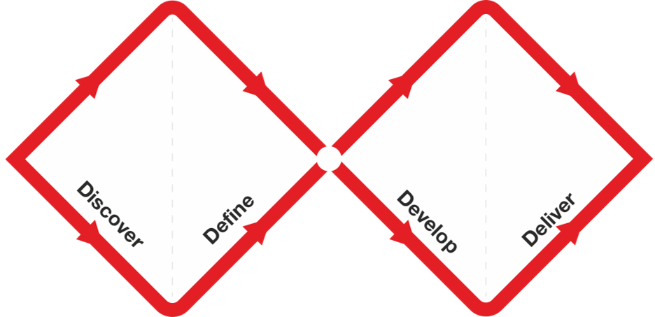
Although the discrete steps may look similar to what we’ve done in the past, AI promises to amplify our efforts from initial research and ideation through to prototyping and delivering. The question will be how to best couple AI’s speed and volume of output with the designers mastery of context, taste, and humanity. Source: The Design Council
Ultimately, this project will give me an opportunity to look deeply at some powerful and very exciting new tools that will surely become part of how we do things. I think it is very clear that, even if the steps of the design process continue on as normal, there is a new and powerful participant that will be at the table to drastically expand our ability to explore and ideate quickly and prototype and even build in ways we haven’t been able to do before. This will be especially true for smaller orgs and design teams who may not have had the headcount to involve multiple designers and technologists on every project.