Paris Olympics (2024)
Almost immediately following the launch of Max in 2023, we pivoted our attention to making strategic improvements to the app to support the 2024 Paris Olympics and the concurrent expansion to 25 European markets. This project was a perfect medley of a high-profile project, with very strict design constraints, that needed to be completed on a tight timeline. My team was responsible for working with our product partners and the IOC on identifying and exploring improvements to the event details page (EDP) that would support the millions of viewers who would need to find and manage hundreds of events efficiently.
Project in a Nutshell
My Role:
Product Design Manager: I was responsible for developing strategy along with my immediate Product partners and executing on that strategy with my design team. This entailed collaborating with product and design leadership to understand Max’ goals for the Olympics, identify improvements to our feature areas to support those, guiding ideation sessions with my team and adjacent design teams, and frequent reviews with engineering partners to ensure our proposals could be implemented within the tight timelines.
Customer Impact:
Addition of ingress into the Olympic schedule (and sport schedule for non-olympic sports) was a huge success with millions of clicks per week
Combining Live and Upcoming events into one tab, reduced user frustration (as seen in post-launch surveys) and saved effort to find and add events to their My Lists
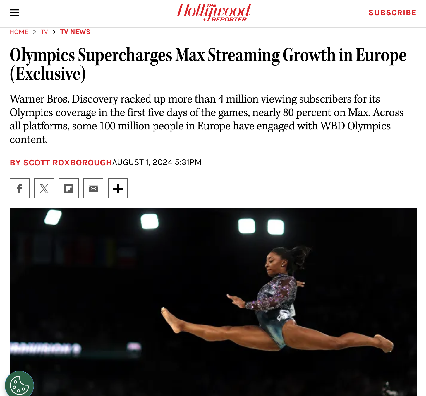
Huge driver of new subscribers to Max, beating total new subs for the entire 2020 games in just 4 days.
Most Fun:
The Olympics are a well oiled-branding machine. It was really exciting to see how that worked in a very compressed timeframe. In a lot of ways it felt like a project that was a tight collaboration among the IOC, Max’s brand expression team, and ourselves, that resulted in a continuously refined and beautiful experience that captured the grace, gravity, and enormity of the Olympics.
Biggest Challenge:
Scoping down to a realistic set of improvements that could be delivered in time. There were a lot of great ideas for optimizing our sports experience, but we needed to focus in on the highest impact features and place all others into the backlog.
What I’d Do Differently:
I would have tried to integrate myself into the branding discussions more deeply. It wasn’t expected for my position as feature design manager, but would have been a really interesting learning experience that doesn’t come often.
User Needs and Feature Ideation
We had been working on the EDP for long enough to understand the constraints we were working within. The early weeks of the Olympics project were spent learning about the specific needs of Olympics viewers and exploring improvements that would support these users as they considered the large number of events we would be carrying. Simultaneously, we were working with the IOC to understand the specific branding requirements and prohibitions and with other teams within Max to understand how th end to end experience would come together. Ultimately, we landed on the following goals to guide our work:
Clarity: How might we design/improve the EDP so that the most important details are immediately decipherable with a natural flow from highly important information and actions to deeper details and secondary actions?
Continuity: How might we make landing on the details page feel like the natural progression in the journey with paths to further exploration when desired?
Action: How might we make the design reflect the energetic nature of live events and provide minimal friction between landing and taking positive action (Playback, Adding to List, Sharing, etc.)?
Extensible and Inclusive: How might we ensure our components are adaptable and relevant for all content types, not just sports and that our experience is inclusive for all Max users?
From this, we decided to focus on a few key improvements that would help users understand what an event was and when it would air, and how to quickly find other and save other events of interest. Specifically:
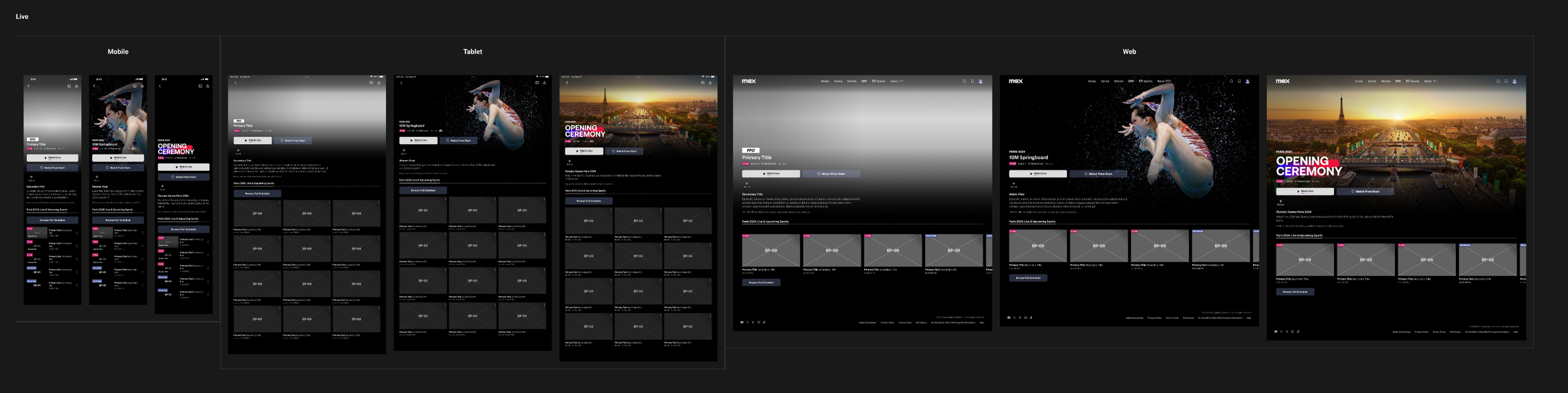
Streamlined Page Design: We had an opportunity to really simplify our pages through improved metadata display and reduced decision points. To make our metadata more appealing through logo treatments (Olympic branding and event-specific logos where available), clean up our badge+time stamp lockup, and add an indicator for Medal Events to signify an event’s importance. The Olympics provided an opportunity to streamline the browsing path to a single tab sorted chronologically with all Live and Upcoming events. This created a one-click path to view and Add Olympic events.
Quick Path to Full Schedule: Max was going to launch a new sport schedule alongside our work, and our user research suggested that the detail page was among the most important places for accessing it. We explored multiple placements and visual treatments and pathing that allowed us to take users to the Olympic Schedule from Olympic events, and to the standard Sport Schedule from non-Olympic Events.
Streamlined Design

We wanted to make each Olympic event feel both individually special and a part of the larger Olympic experience, so it was important to support vivid branding of key events (event logos) and support a shared visual language for all Olympics events (Paris 2024 logo) . We also cleaned up the metadata presentation make it easier to find air dates and clearly indicate whether it is Live or not.

It was important to us that, wherever possible, improvements would be applicable outside of the narrow confines of the Olympics. The improvements to our info block would live on to improve how all sports were displayed within Max and support easy context setting and understanding.

Due to technical limitations, we had traditionally broken out Live and Upcoming into two tabs. The Olympics provided an opportunity to streamline the browsing path to a single tab sorted chronologically. This would make it a one-click path to view and Add Olympic events.

While the main driver of the tab update was the Olympics, it was also an improvement that extended to all future events on Max. We integrated the updates into all of our Event Detail Page templates across sports and entertainment.
Quick Path to Schedule

Providing easy access to the full slate of Olympic (and sports in general) coverage was identified as a top priority. We explored a wide variety of options that we then vetted with engineering to understand complexity given how tightly intertwined our templates could be. We needed to consider user intentions (what were they looking for, how much info did they need, etc.), how each model translated across device types, and the tradeoff between fewer clicks (display all events on page) vs. the ease of filtering/sorting that the dedicated schedule provided.

One of our first favorites was to use the first tile as a quick link into the schedule . This approach seemed to promise the quickest path to the schedule and an easy to learn pattern. However, when we did usability testing, we found that users failed to realize that the tile was a link and so never discovered the path to the schedule, leading to further exploration.
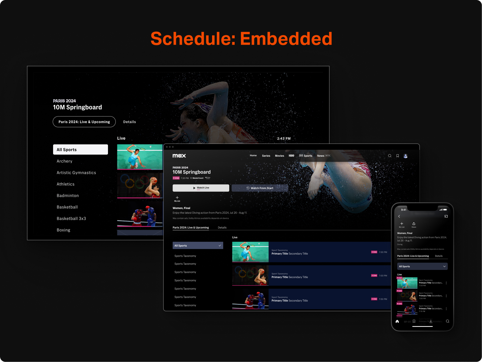
One of the more elaborate explorations we did, was one that embedded the full schedule within the tab on the CDP. This would utilize the powerful filtering in the schedule and reduce the need to load a new page to find what the user is looking for. After some engineering investigation and considering our other options I steered the team away from this approach since it added too much technical complexity while also embedding too much to the detail page that wasn't truly related to the event the page was built for.

It had been a longtime desire to accomodate more than one rail beneath the tabs, so we investigated if this might be our opportunity to update the page to support that capability while also solving the problem of ingress visibility. In the end, this seemed to add too much visual noise to be a good solution for this immediate problem, but it allowed us to further refine our approach to multi-rail tabs and understand the opportunities and limitations of that pattern.

Our winning solution was a simplified single tab that would house live and upcoming events in a single rail, but would have a very clear entry point to the schedule. It wasn't as visual as the tile, or as complex as the embedded schedule, but it would provide clarity for users and connect them to the events that they love in the best way possible within the timeframe we had.
Launch
Max’ Paris Olympics coverage was a great success, establishing our product as a major international streamer. We saw impressive engagement with the EDP generally, and a lot of traffic using the new features, especially the ingress to the schedule.